- Scythe is a bit of a slut, dressed to effect and quick to give up the goods.

The early 2000's saw a transition in the Doom map making community. The old crews behind classics like Memento Mori and Requim were no longer active. At the start of the millennium however, several high profile next generation projects emerged, occasionally raising the bar for gameplay quality and visuals in the process. Among the most successful ones to do this was Swedish author Erik Alms' Scythe. Born from the standpoint of "less is more" and no doubt created to entertain the author himself as much as the general audience, Erik molded his trademark style with Scythe, one that has made him a favorite author among many players, and influenced tons of projects since.
Erik is legendary for his work pace, and Scythe was put together in record time. The txt is a testament to his honest approach and lack of prestige and up-tightness about his own work. Lets do a snippet from it to illustrate this;
"This megawad doesn't have perfect texture alignment, insane detail and fantasticly hard gameplay. Instead it focuses on small fun maps to blast through without much thought about defense. The difficulty rises steadily as you go through the maps and the last few should challenge even the best."
There's a few new textures present, the most noticeable being the Ultimate Doom Episode 1 and 3 skies, as well as a new moody sunset creation for the 2nd episode. It also include a rather prominent grey water, used with mixed results.
On with the running shoes though, lets get going.
MAP01 - Get Going!
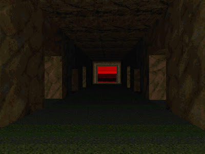
[Johnsen]
Tradition has it that the first map in a megawad should not overwhelm in size, and this did not set out to change the recipe. It's a tiny slice of a map, consisting of two clean brick buildings, with a little yard in between them and a surrounding wall. Behind the wall you can peak at a grey lake, one I'd much prefer to have seen in blue striking colors, since it's hardly noticeable. The route is almost nonexistent, we simply had to pass the fast closing door bars in the brown brick building, and snag the red key from a pillar. I find the fast close door lines extremely noise intrusive, since it's a WR-line. It needs to be repeatable somehow since you don't wanna let the player get stuck after a death, but this should have been done differently to avoid the noise. Light beams from a column inside the building, instantly setting the level of quality for the kind of smooth lighting Erik applied all through Scythe. The highly nostalgic mountain clad Doom Episode 1 sky looms above, and creates a sullen and isolated feel. We collected a shotgun, the chainsaw, a chaingun and even a rocket launcher on the multiplayer setting. Nice stuff to pocket, but hardly utilizable in a map with only a few imps and zombies roaming around. More could have been done with the outside area for sure, but the interiors of the two tiny buildings are okay, in particular the red part, showcasing some well placed windows above the staircase. I do not mind this map the slightest, but it offers almost nothing. No secrets are present, but a sector is tagged so you'll exit with 100% in any case.
Aesthetics: 3/6 - Layout: 3/6 - Gameplay: 3/6 - Score: 9/18
[Hunsager]
This map has got two small buildings, a red key, a small yard and four weapons in multiplayer (SG, CG, RL, CS). There's a nice variation with the different brick textures on the two buildings, and the front of the northern one using "Brick12" looks good with the two techno pillars supporting it. Apart from that, there isn't much to say about this opener. This map gives a good impression of what is to follow. More or less every map in Scythe will overuse the keys and practically have no secrets at all. It's difficult to award such maps with many points for layout because of their very limited size.
Aesthetics: 3/6 - Layout: 3/6 - Gameplay: 3/6 - Score: 9/18

MAP02 - Punchline
[Johnsen]
The first view is a moody one, as a striking, beaming light effect greets us in the hallway ahead. I love the shape of the sectors applied to this detail. This small tech-base have parts that look great - like the yellow key hall with the berserk triggered ambush, or the set of acid pools near the exit, accompanied by "Browngrn" walls. Other parts though, like the acid corridor with the green armor, and the secret garden area, seem too bare and simplistic. It would be very tempting to add a little more detail to the outdoor area, as it's very nicely shaped and adds a ton of location feel even in its simple state. The way to enter and exit it was nifty as well. The gameplay is way too easy to offer any challenge for two players, but if you apply some Tyson skills you'll hardly be bored. There's a few lazy texture alignment issues to be found, but nothing too intrusive.
[Hunsager]
This map is made up of two rooms, three hallways and a passage with green slime. There's a yellow key, a berserk, two proper secrets and two bio suits to be found here. There's a nice use of the moon base "Browngrn" textures, and after you climb a little ledge to get to the secret garden with the invisibility, you almost get a flashback to Ultimade Doom Episode 1.
Aesthetics: 4/6 - Layout: 3/6 - Gameplay: 3/6 - Score: 10/18

MAP03 - Up and around
[Johnsen]
Another tiny one, this could perhaps have cut it as a Map01, but at the third slot one expect a slight size increase. I did not care too much for the visuals, apart from the tasty texturing. The tech-columns give it a somewhat memorable look, but perhaps mainly because they feel out of place. I appreciate the smooth light effects applied to the interior parts. The keys felt completely wasted here, and didn't add anything to a map this small. Cool little detail with the exit switch that raise as you enter the final podium. I noticed the far off wall close simultaneously, and have to wonder if this is a VPO workaround. We snatched a BFG here, and pocketed it for later use. The gameplay flows quite well, and the berserk is fun, but you hardly get going before it's over. I noticed that there are some obvious copy-paste texture errors present in the hallway with the blue key bars, looks like some "Brick10" made it over from the opposite section.
Aesthetics: 3/6 - Layout: 3/6 - Gameplay: 4/6 - Score: 10/18
[Hunsager]
Again it's a very small map. The path takes you around a yard with "Browngrn" and metal textures, and utilize the tall techno pillars which isn't a good combination to me. Two keys in this small map surely seems like overuse. Since we picked up the BFG and the SSG here, there must be a lot of bad-asses waiting for us in the next level?
Aesthetics: 3/6 - Layout: 3/6 - Gameplay: 3/6 - Score: 9/18

MAP04 - Lost warehouse
[Johnsen]
This place is moody and interesting. Aside from the pointless acid pools which instantly teleport you back up, this is a rather functional map. It's simplistic, but very tasty. I particularly enjoyed the visuals with the striking red key card against the dark room, perched on a window still - and the large nearby pillar with the beaming light effect, those always look great in a darkly lit map. The contrast created by changing textures and raising the light-level inside the small key storage room, adds to a cool view from the outside. Jumping across a gap to get to the key seemed a fun little design twist, but the obvious highlight would be the revelation of the sizable outdoor area as you flip a switch past the red door. The fact that the ledge behind the blue key is lower than its surrounding walls, ads a really nice touch as well. If only the map was bigger, this could have been a real treat. It's memorable as it stands anyway though. The multiplayer BFG in the exit is pointless unless you for some obscure reason decide to do a deathmatch here. The gameplay is way too simplistic and dull and merely a small distraction; time to crank it up Erik!
Aesthetics: 4/6 - Layout: 4/6 - Gameplay: 3/6 - Score: 11/18
[Hunsager]
There were no bad-asses in this level at all, rather only 28 low end monsters. We encountered some shotgun guys, troopers, demons, specters and for the first time we met some lost souls. Is it because of the lost soul appearance the map is called "Lost warehouse" or is it because it's just empty? Two dark rooms with four crates feels more like a failed attempt of making a warehouse, unless the author really thought an empty warehouse was a great idea. Apart from adding the plasma to our arsenal, this map offers nothing, so I'm afraid I can't award the idea of emptiness with too many points.
Aesthetics: 3/6 - Layout: 2/6 - Gameplay: 3/6 - Score: 8/18

MAP05 - Slimy tunnels
[Johnsen]
If done right, it doesn't take more than this to make a map with some merit to it. Erik decided to put us on top of a divided cliff with acid at the bottom, letting us look directly at the exit door across the gap. To get to it, we had to drop down and follow the acid trench to the left to get the yellow key, then head the opposite direction to get back up. Visually, everything is proper polished here. It sports great use of textures, very nice smooth light effects - and some slick bends and nooks in the yellow key room. The gameplay is fast paced and smooth as well. You're eventually greeted with two cacos that surface from a pair of revealed alcoves next to the exit door, a cliché perhaps but it's still neat. The main gripe is obviously the ridiculous size of the map. It's a tasty quick snack, though.
Aesthetics: 4/6 - Layout: 4/6 - Gameplay: 4/6 - Score: 12/18
[Hunsager]
This is the first map in Scythe which I actually like, but as always it's way too short. There is a nice combination of the "Brown1" and "Browngrn" textures with the "Tlite6_6" flat supplying lights above the slime. For the first time we meet some chaingun guys and cacodemons.
Aesthetics: 4/6 - Layout: 3/6 - Gameplay: 3/6 - Score: 10/18

MAP06 - Pressure point
[Johnsen]
This is the first map of the episode that I basically dislike design wise. It's as incredibly simple as the previous five maps, but not equally interesting to look at, nor as functional. A black metal base divides the location in two, and to each side you'll find a large, grey outdoor area with barrels and a few clusters of monsters. A cheap looking acid pool seems hastily added in order to represent some detailing, and we get a storage room with a real nice over-sized pillar radiating light in every direction - identical to the one in the previous map. After passing a rather silly looking construction with an over-sized crusher, and killing a few hell knights in the process, we drop into a very disjointed looking section that greet us with a lava moat and some "Ashwall" texturing. The cave is guarded by four cacos and two pissed off hell knights, adding a bit of a sudden challenge. This section looks extremely out of place in the map, and although such can add variation and some abstract qualities on occasion, it does nothing of the sorts here. The gameplay is not crappy though, and picking up the berserk early on will make it a fun fist fight, especially if you can trigger the barrel chain explosion to mutilate the imps. It probably works better from scratch and on singleplayer however, since we came to it a bit loaded - more monsters on the multiplayer setting would have helped its case.
[Hunsager]
This map consist of two parts, a large building with a rocket launcher placed in the center of a giant crusher, and a dark cave. A bunch of imps are lined up in one corner together with some barrels, and inside the buildings crusher area you'll find a few hell knights. This feels empty and dreary, and as soon as you drop down in the sad hell pit, there is no return. I don't usually like it when the player is prevented from backtracking, but maybe it's a good decision here since there wasn't much to go back and look at. This is the kind of map you just can't exit soon enough.
Aesthetics: 2/6 - Layout: 2/6 - Gameplay: 3/6 - Score: 7/18

MAP07 - Deadly
[Johnsen]
Well, this is a shoe box with the madatory mancubus and arachnotron combo. Someone overcooked Dead Simple, and shrunk it considerably. The height differences makes it easy to dodge the mancubi by simply running downstairs and circling them, and then one simply climb back up to snipe at the spiders afterwards. This pretty much renders the gameplay moot, but you'll be nailed quick if you screw it up by positioning wrong. Nice light effects, and nice texturing. Low functionality and way too cheap, though.
Aesthetics: 3/6 - Layout: 2/6 - Gameplay: 3/6 - Score: 8/18
[Hunsager]
This Dead Simple clone is much smaller and easier as you can find a safe spot from both waves of monsters. If you quickly jump down and stand on the lower level to kill the Mancubi, and then run back up when the spiders arrive, you'll will make it through with a little patience. This map is a good example of how putting large monsters in tight quarters just isn't the right way of using them to good effect. Luckily, the mancubus and the arachnotron are not used very often in Scythe. Erik also went a little heavy on the rocket ammo here.
Aesthetics: 3/6 - Layout: 2/6 - Gameplay: 2/6 - Score: 7/18

MAP08 - Garden base
[Johnsen]
I really enjoyed the layout and theme here. The Dwango5 Map01 inspired "Browngrn" textures combined with a grassy outdoor field is always a good one. There's some tasty pillars and a podium with a supercharge as a main attraction, and you'll have to follow the winding road around the yard to get to the exit. There's a sudden heavy weapon dude ambush greeting you before the exit bars lower, adding some tense action. We snagged the 100% charge by doing a SR50 jump from the nearby ledge, a trick Erik undoubtedly intended as an option to the the secret teleport. The gameplay is quick and tight, making this an enjoyable and visually pleasing map. The best one so far, I'd say.
Aesthetics: 4/6 - Layout: 4/6 - Gameplay: 4/6 - Score: 12/18
[Hunsager]
There is a nice combination of "Browngr" and "Brick10" in this little garden base. I was hit by a mancubus in the start, putting me at low health for the first time in the coop session. I like the path in this one with the bridge that raises up, and how it leads you around at the edge of the base. There is even a real secret this time awarding us the very first supercharge. The chaingun ambush in the exit is probably the first scary trap we've encountered, although you'll smell it just before it happens. This must be the best map so far in all aspects.
Aesthetics: 4/6 - Layout: 4/6 - Gameplay: 4/6 - Score: 12/18

MAP09 - Computer storage
[Johnsen]
This is a really cool tech-base, with a strikingly neat three story feel because of the structural build of the inside. I really like the texture theme put to use here, with its brown and orange qualities; it feels sort of like an Ultimate Doom Episode 1 base, but deviate enough to make it less easily categorized. The yellow and red key placements are nice and acceptable, but the blue key feel wasted here as it's just tossed in an alcove along the way. Because of the scale of the outside area, and the small outdoor storage part with the red key, there is plenty to look at, and it creates a good sense of location from the get go. The gameplay flows well, but still fails to offer any challenge at all on multiplayer. My favorite spot would be the scenic window views you get from the exit hallway, thanks to the elevated height.
Aesthetics: 4/6 - Layout: 4/6 - Gameplay: 4/6 - Score: 12/18
[Hunsager]
There's two open crates facing you in the start, both of them marked secret. Couldn't they at least have been facing the wall to be a little less obvious? But no, it looks like Scythe is determined to ruin the concept of secrets in Doom. The base has a good looking exterior, but as usual it doesn't host much of an interior. The only interesting aspect is the height variation applied to make the three different floors. The map also introduce the revenant.
Aesthetics: 4/6 - Layout: 3/6 - Gameplay: 4/6 - Score: 11/18

MAP10 - The Lords
[Johnsen]
A completely wasted map slot this, as Erik decided he needed to kill us off before the continuation of "Episode 2". I really hate this gimmick, since it's completely possible to leave the player stacked with his weapons and still create challenging gameplay. The map is basically just a small part that looks like a continuation of the previous map, and a following part with a winding staircase inside a brown cave with a lava lake at the bottom. Not only do the areas clash badly thematically, to make it worse the transition between them is just lazy. Not sure if the berserk in front of the kill exit was supposed to taunt me, or provide Tyson action if I'd want to do a speedrun or maxkill. Probably the latter, knowing mr. Alms familiarity with the Compet-N crowd. There is a striking texture miss-alignment error greeting you in the very start too, at a minimum one expect such to be in order in maps of such limited size.
Aesthetics: 2/6 - Layout: 2/6 - Gameplay: 2/6 - Score: 6/18
[Hunsager]
This map continues the texture theme from the previous level, until you're dropped into the next section. This is supposed to be some kind of a boss map, but a dark cave with lava, two mancubi on a pillar and four barons roaming in the dark just isn't good enough. The mancubi won't pose a threat as the fireballs can't reach over the edge of the cliff. There was a lot of ammo here, but the player has to die anyway and lose all his stash as he can't avoid getting killed in the exit. I never liked this concept, but what's even more provoking here is the berserk power-up laying right next to the exit. Looks like it has been placed there just to mock the player: "Here is some health for you before you die". This was a weak finale to a very weak first episode.
Aesthetics: 2/6 - Layout: 1/6 - Gameplay: 1/6 - Score: 4/18

MAP11 - Sneak peak
[Johnsen]
This map is somewhat interesting, despite obviously being content with mediocrity. The idea of being able to unlock a great portion of the "Ashwall" mountain to get an overview of the blue key cave, is cool. It allows for several ways to approach the map, which can be useful given its deadly arch-vile trap. My partner ate a megasphere, and survived the ordeal. For me it became the first time I had to respawn in the coop session thus far, as the heavy weapon dude ambush near the start stopped my frantic escape attempt. The blue key trap setup is pretty straight forward; pick it up and you unleash a sizable army of spawned monsters, with an arch-vile well protected in its midst. There is a very handy BFG available on multiplayer only, and we should have gone for this before snagging the cursed key. There is some weirdness involved with allowing for a strafe jump through the window of the red key building, with a secret passageway leading you back out. A very cheap map, but it does just enough to satisfy mildly.
Aesthetics: 4/6 - Layout: 3/6 - Gameplay: 4/6 - Score: 11/18
[Hunsager]
This map is tight on the ammo and marks a clear step up in difficulty from the first episode. You start next to a building reminiscent of the construction in Map01, and there is a cave with a nasty arch-vile trap. We walked right into said trap and found ourselves in serious problems. There is a BFG on multiplayer in the center building, and utilizing that weapon could perhaps have prevented the arch-vile from resurrecting everything inside the cave.
Aesthetics: 4/6 - Layout: 3/6 - Gameplay: 4/6 - Score: 11/18

MAP12 - Walk in the park
[Johnsen]
This map is such a tease. It's the first one that really shows signs of Eriks' abilities to create great atmosphere through tasteful texturing and moody light effects, yet he offers nothing but a hasty look at it as the exit is reached far too soon. You start in a brown brick building, and it's surrounded by a darkly lit garden area with various constructions and some free roaming monsters scattered around. The foreboding red sunset sky is simply beautiful, and works wonders here. This is borderline too cheap to be called a complete map, but somehow Erik gets away with it, and even have the audacity to utilize all the keys. Big thumbs up for the excellent light effect radiating from the brown brick buildings entry point, and the neat row of lights across the acid river leading to the yellow key. The supercharge on the pillar simply required one to press it, how disappointing, one could have added some creativity involved with getting it but Erik opts out. This map is more of a challenge on singleplayer I'm sure, on multiplayer it stays true to its title.
Aesthetics: 3/6 - Layout: 2/6 - Gameplay: 3/6 - Score: 8/18

MAP13 - Subverted base
[Johnsen]
Fun, fun! Excellent gameplay makes this tiny tech-base a blast. This is easily one of my favorite maps thus far. There's an excellent mix of monsters here, and some traps that you'll quickly dispose of. The base is firmly resting on an "Ashwall" mountain side, and you need to run through its sparse sections a few times to grab two keys, before entering the exit building situated on top of the cliff. The teasing plasma and supercharge pillars can be reached through a secret area you'll hardly miss if you just search a little.
Aesthetics: 5/6 - Layout: 3/6 - Gameplay: 4/6 - Score: 12/18


MAP15 - Blood bath
[Johnsen]
If one lined up all the clones of Doom II's 14th map "The Inmost Dens", one would see a row of good looking maps that all sacrifice creativity in order to tribute the greatness of their origin. This is not the best clone I've seen, since the extremely short duration kills it competition wise, but it's alright. There is a somewhat nasty revenant and arch-vile ambush protecting the red key, but besides this part it's relatively easy. If you want to shorten your stay you can easily jump onto a ledge and leave the intended route be. The secret exit is way too easy to find; just ride the lift-door in front of the regular exit, and jump across the ledge to the left. The map spout some nice views and it's probably pushing the limits of the vanilla exe because of the wide open architecture, and the choice of using blood instead of water also works. Plutonias 18th map, another superior clone, already did this though. It leaves a mixed taste for me, since the author is in such a hurry with getting you to the exit. The gameplay is rather entertaining, and it looks nice, one can't argue that.
Aesthetics: 4/6 - Layout: 4/6 - Gameplay: 4/6 - Score: 12/18
[Hunsager]
Successful tribute maps to "The Inmost Dens" have been made before, so maybe the author thought this "Inmost Mini Dens" would be an ingenious concept. He just shrunk the whole thing and assured you could run around in Compet-n-style on the ledges. Right before discovering it, we mockingly said "I'll bet there is a secret with a spider somewhere". There are two arch-viles in the exit who can be difficult to fight due to the double set of doors.
Aesthetics: 3/6 - Layout: 2/6 - Gameplay: 5/6 - Score: 10/18

MAP31 - I dunno Torn
[Johnsen]
With 126 monsters to slay, this is the most populated map so far. The first secret level is the only map in the set created by another author. Kim "Torn the Dark" Bach is a Danish author who have contributed to several projects through the years. Although architecturally not a very strong mapper, he have a knack for creating fun romps, and this is no exception. Even though the map is extremely mundane in its grey / green rock texturing, the gameplay just works here, much thanks to well planned traps and the scale of the architecture. You get the first multiplayer only Cyberdemon here, one we easily disposed of with our loaded BFG's. The secret exit was too easy to locate, since running across the pillars and pressing the slightly different textured wall, was discovered instantly upon arrival. The map proper creates the sensation of having you run around in the catacombs beneath some over-sized castle, but there's very little to look at as far as detailing goes. Bach even applied the terribly cartoonish yellow candelabras in an attempt to decorate the place, but I'm not on board. It basically looks like a 1995-96 retro map. The secrets are numerous compared to its comrades in the megawad, counting five in all, but they are all randomly distributed behind slightly different textured walls, with door-tracks that are not unpegged. It's visually very underwhelming for a secret level, but more importantly it's a fun map, and this was probably the reason why Erik decided to include it. The maps name is also highly amusing, and having somewhat of a shared backstory with both authors I can imagine what it was about. How nice of Erik to give his coauthor credit on the title-pic based on this single contribution.
Aesthetics: 3/6 - Layout: 3/6 - Gameplay: 5/6 - Score: 11/18
[Hunsager]
There are two large halls in this map, connected with stairs and hallways, thus making the layout quite linear, and there is the usual overuse of keys. So, I dunno either, Torn. Since the layout isn't that advanced, and the level is a subterranean map that only use one texture, I feel that I can't award it with top scores for its aesthetics and design. But it plays good and it's got a Cyberdemon and a high monster count for a Scythe map, so that's promising. Maybe there will be some maps in this megawad that can come close to Doom II in terms of challenge?
Aesthetics: 3/6 - Layout: 3/6 - Gameplay: 5/6 - Score: 11/18

MAP32 - Enoz Soach
[Johnsen]
The super-secret map is usually a short affair, and Erik decided to follow that tradition as well. You get two sections, each with juicy waves of monsters spawning in and around the center, and enough ammo and health to move them down as long as you do not get swarmed and eaten first. I survived, but I'm sure the weapon advantage from the previous maps had a thing to do with that. The gameplay is actually quite fun here, and since this is obviously a concept map, one cannot help but accept that it works just as intended.
Aesthetics: 3/6 - Layout: 3/6 - Gameplay: 4/6 - Score: 10/18
[Hunsager]
A very short and chaotic map, but acceptable as a super secret map. It has a set of clever traps and a lot of monsters spawning in. I should note that I had my first death in this map
Aesthetics: 3/6 - Layout: 3/6 - Gameplay: 5/6 - Score: 11/18

MAP16 - Burial grounds
[Johnsen]
Oh, but this is sweet looking. Painfully short, yet deliciously sweet. You start at the bottom of an orange rock ravine, and you'll have to stroll upwards along the side of the cliff and into a rocky yard displaying a closed off temple and a pool of grey water. To the left there are more rocks to climb, and as the mountain plateaus you see a neat little graveyard, with an obviously booby-trapped plasma gun. The blue key tastefully rest on top of a ledge with a great outlook of the temple, which conveniently unlocks as you jump down. The inside is a typial Doom church-temple with the mandatory row of benches. A yellow key is resting on a demonic altar. All you have to do to get it is to flip a few switches to the left and right, and then exit - if the arch-vile protecting it do not fry you first. The gameplay stays relatively slick and fun here except for some cramped fights inside the church, and it's mildly violent for such a short tour. This is one of the maps one wish would go on for much longer since what little you get is ripe with mood and atmosphere.
Aesthetics: 4/6 - Layout: 3/6 - Gameplay: 5/6 - Score: 12/18

MAP17 - Book Lords
[Johnsen]
Another excellent but short piece this, you won't have time to read any of those books though, because the Lords are fretting. There's plenty of nice ambushes, and a good variation of monsters - among them some decently situated arch-viles and a nasty revenant spawn ambush. The detailing and theme is nice and warm to look at, but perhaps a wee bit repetitive as far as the light effects go. I really like Eriks' texture combo on the bookcases, these work great with the overlaying theme of brown bricks and marble. You'll be running back and forth between the upper and lower areas here, while splattering unleashed groups of monsters with your rocket launcher. Good fun!
Aesthetics: 4/6 - Layout: 4/6 - Gameplay: 5/6 - Score: 13/18
[Hunsager]
A hellish library with some good traps. Short map as usual, but it's packed with monsters which means it last a bit longer and the gameplay is fun. The bookshelves look good, but some more texture variation wouldn't hurt.
Aesthetics: 3/6 - Layout: 3/6 - Gameplay: 5/6 - Score: 11/18

MAP18 - M/S Futura
[Johnsen]
Compared to the previous two maps, this looks like a quick hack, and I wonder if this is an early creation by Erik that somehow made it to a late map slot. A concept map like this should put way more effort into creating excellent scenery. The reddish sky and the dim light level adds atmosphere though, and the distant crane construction provide something to look at; however the ship looks like something a six year old would draw in his notebook. There's a Spider Master-mind guarding a really neat looking exit gateway which utilize the Doom Episode 3 sky to great effect. We also get to see a short but tasty 3d bridge, and though it's a weird design choice in a simplistic map like this, at least it adds something memorable to look at. The gameplay is somewhat of a joke on multiplayer, counting only 25 monsters. However, when approached from scratch on singleplayer it works much better. Since no extra monsters were added though, and with weapon advantage from the previous maps, this is barely a filler. Strangely enough it's also slightly memorable because of its simple visual gimmicks, and you see what it's supposed to convey, it's just not executed very well.
Aesthetics: 3/6 - Layout: 3/6 - Gameplay: 4/6 - Score: 10/18
[Hunsager]
This map features the first Spider Master-mind, and put you in some kind of a shipyard area. There is a loader and a ship, which is probably the M/S Futura. A ledge makes it possible to jump down in the water and pick up a megaarmor and also let you take a closer look at the ship. You can't avoid noticing that there hasn't been put a lot effort into making that ship look beautiful. Since it's shaped so simplistic and blocky, it would have been for the better if you couldn't walk up close, and rather just saw the dark silhouette of it against the horizon. The nice looking portal can't save this map on its own, and when the monster count is so low, the gameplay won't get a high score either. Be ware that it's possible to get stuck behind some of the crates in the "secret" sector next to the start area. Beta-testing, beta-testing, please don't forget that!
Aesthetics: 2/6 - Layout: 2/6 - Gameplay: 3/6 - Score: 7/18

MAP19 - 3000 AD
[Johnsen]
The 3000 part is left out of the in-game title of the map, probably because someone was too lazy to add the digits to the Doom font, ho hum. That is about the only thing I have to bicker about here though, because this is a jackpot. Actually it's easily my favorite Scythe map. It showcase a super slick design clad in silvery colors that make for an awesome contrast with the explosively red, orange and black sky. This is like a mixture of Romero's "Knee-Deep in the Dead" style and Fredrik Johansson's Vrack series - perhaps more the latter than the former. Random crates, beaming lights, ledges, stairways that gets increasingly more dark and beautifully situated windows and outlooks greet you along the way from start till' finish. It's the first map of the megawad that feels like the author did not move on to the next in a hurry. Obviously he saw that this was too good to end prematurely. It's still a fairly small map, but it feels like less of a shoe box than most of the megawads offerings, and the gameplay is polished, slick and highly satisfying. The scenic view you get from the yellow key ledge towards the bridge construction, beautifully set against the sunset, is absolutely stunning - by far the best view you'll get in any of the 32 maps in my opinion. The gameplay is most excellent, well helped by the open and well scaled architecture. If one would critique it for something, I'd say it perhaps lends a bit too much from Vrack with the way certain details are executed. One can easily forgive inspired stuff though, as long as the map creates its own identity, and this one does.
Aesthetics: 5/6 - Layout: 5/6 - Gameplay: 5/6 - Score: 15/18
[Hunsager]
Finally Scythe delivers a map with a rewarding duration! This is a good looking starbase city with a decent amount of monsters. This is Doom, this is how to do it. If only the megawad had more maps of this size and quality! The grey and silver color theme gives the architecture a somewhat futuristic look, so you could say the map lives up to its name.
Aesthetics: 5/6 - Layout: 5/6 - Gameplay: 5/6 - Score: 15/18

MAP20 - Starport
[Johnsen]
This is obviously a continuation of the previous map, but somewhat less impressive and in more of a hurry, with an almost pointless red key tossed out randomly behind a crate. The silvery textures are still as charming against the red sky however, and the gameplay is great fun. You get a tense cyber situation here - but the setup is most fair and forgivable. The red "S" arena and the hall next to it with the megasphere and the numerous imps, would be the architecturally best parts of the level. There's an annoying missaligned texture to the side of the lift past the yellow door, one of those visual flaws that Scythe didn't need to have. It being Map20 and the end of an episode, Erik decides to kill us off once more - this time I sacrificed myself for the greater good, chanting a few cuss-words in the process.
Aesthetics: 4/6 - Layout: 4/6 - Gameplay: 5/6 - Score: 13/18
[Hunsager]
This is the map with the cyber standing in front of the big S as seen on the title-screen, and it continues the texture theme from the previous map. This is a much better boss fight than the lame monster fight which concluded "Episode 1". Strangely only one of us was killed upon exiting this time. I like the gameplay here, except for the solution with the exit.
Aesthetics: 4/6 - Layout: 4/6 - Gameplay: 5/6 - Score: 13/18

MAP21 - Solitude
[Johnsen]
With high expectations and fond memories I end up less than impressed by the hellish opener of the third episode. It showcase the mandatory red cave area, and utilize some rather simple but sweet fading light effects, radiating from various columns. The best view comes by the rocket launcher area, where you get a small panorama of the lower cave. This all is so small it hardly qualifies as a singleplayer map - luckily the gameplay is well balanced - although I would think it works better on singleplayer than with two juiced up marines at work. It's a moody and nice looking cave, but so small you could hardly fit a couple of bats in it without crowding the place.
Aesthetics: 4/6 - Layout: 3/6 - Gameplay: 4/6 - Score: 11/18
[Hunsager]
This is the first of the red hellish maps, and it only consist of four small caves, two stairs and a winding hallway with an invisibility and a berserk. As you are supposed to have lost all your weapons, and with scarce ammo at hand, you are meant to fist your way through this map in singleplayer. Because of the limited navigation space in the last cave, I accidentally exited before killing the arch-vile. The map sets the mood and atmosphere for the last episode, but since it's so small and since there are hardly any monsters present I can't possibly award this map with many points.
Aesthetics: 3/6 - Layout: 3/6 - Gameplay: 3/6 - Score: 9/18

MAP22 - Despair
[Johnsen]
This continuation of the red caves turns into more of a map than the previous one, and it has a really neat looking outdoor area with a blue key perched on a ledge, and some large, nice looking arches leading in to it. I like the fact that it mixes "rockred" and "blood" instead of the more often used lava combination, especially since Erik took care to illuminate some of the "bloodfalls" properly. My partner quickly discovered the BFG at the bottom of the shaft, behind the pass through texture, and it came in handy here. The texturing is repetitive, but you wont mind that too much since it's all nice and glowing. I suffered two deaths during the span of the map, the first ones in a long time. One get a really nasty trap before the exit here and things are starting to heat up, as if the red rocks didn't supply enough of that on their own. Overall the map falls short of any kind of greatness, but it establishes some of the hellish architecture that Erik received much acclaim for later in his mapping career.
Aesthetics: 4/6 - Layout: 4/6 - Gameplay: 4/6 - Score: 12/18
[Hunsager]
I had a lot of health left from the previous level when I entered this one, and with good fortune I accidentally fell into the blood filled shaft and discovered the BFG. Both the design and the gameplay is good in this one, and the excitement and action was present all the way to the exit.
Aesthetics: 5/6 - Layout: 4/6 - Gameplay: 5/6 - Score: 14/18

MAP23 - Anger
[Johnsen]
Erik steps up the visuals another notch and really capture the essence of what makes a good looking hellish cave map. The large arches before the BFG cave gives a foreboding and majestic feel. The cave itself is beautiful with all its ledges and curving rocks, and it's certainly rather impressive for a vanilla exe creation. There's less props to be given for the layout than the undeniable eye candy however, as the keys are merely a quick walk away from being collected. I didn't particularly care for the randomly placed rocket launcher either, as it's just laying at the end of a bend near the start. In contrast, the chaingun podium with the overlooking windows and glowing decoration would be one of the best visuals in the map. I'd tag this as the first real slaughtermap of Scythe since it holds two roaming Cyberdemons and spawn tons of monsters into the outdoor start area, creating a boiling inferno. It's not unfair, but it can quickly overwhelm. I would assume the gameplay is quite fun if one carefully plan the route, less so when you are just being grabbed by the ass and tossed around the first time over. The exit podium seems a bit underwhelming for such a visually pleasing and tiny map.
Aesthetics: 5/6 - Layout: 3/6 - Gameplay: 4/6 - Score: 12/18
[Hunsager]
This map attempts to crank it up a step from the previous as it's a little bigger and a lot harder. There are several reviving arch-viles and two cybers here, and the yard will fill up many times by monsters spawning in. The arch-vile on the pillar is tricky, but if you really want to escape the inferno quick, it's possible to grab the supercharge and make an arch-vile jump for the exit.
Aesthetics: 5/6 - Layout: 3/6 - Gameplay: 4/6 - Score: 12/18

MAP24 - Hatred
[Johnsen]
As expected, the slaughter maps are lining up quick now. This would be the first map that really kicked our asses, though mostly due to bad planning and with neither of us knowing the map well enough. I do not particularly enjoy the murderous row of caged mancubi high above the red key, they add little to the gameplay except annoyance, and they become a pain to dispose of unless you get some luck based infights going. Infights would be a key word if you want to survive this thing, and at least if you plan to record a fast maxkill demo. If we only knew in advance that the BFG was nesting inside the blue door, then I would have made a run for that from the get go. To get that far though, you also have to pass an army of revenants residing on the upper mountain area. The visuals are somehwat varied here, at first it all looks striking since it's proper dressed in red rock textures, but when you do an in depth look, there is a lot of simple design gimmicks on display. I really like the yellow key hall with the tall pillars and the flickering light casting shadows, it's quite the mesmerizing view. Overall this is not bad for such a mean, open slaughter map, and there is only that much you can do under the vanilla exe with designs of the kind. The fact that we died a lot hampered the flow considerably, but I'll be forgiving on my awarded points here, since I know the map could be approached very differently.
Aesthetics: 4/6 - Layout: 4/6 - Gameplay: 4/6 - Score: 12/18
[Hunsager]
This is where it gets real nightmarish as the gameplay loads up and overwhelms you. It's another hell red battle-yard, though with bigger scale and more of the high end monsters. The red theme is starting to feel overused by now. You'll have to proceed carefully in this one to survive, something I didn't do. I feel something is wrong with the layout and the combination of monsters here. It looks like you are dependent on making infights as you won't get the BFG before eventually getting the blue key, however it wasn't easy to make infights here as the cyber and the mancubi are so withdrawn from the center of the action. We were also running around in circles for a while before we discovered the lift that leads to the revenant army and the blue key. If you get killed by this horde as I did, it's very difficult to get back up and take them down as you won't reach the much needed rocket ammo. Could it perhaps have been more fair placing the ammo at an earlier spot? To me it feels like Map24 is the less clever big brother of the previous two, and the design and details in this one aren't as elaborate or advanced.
Aesthetics: 4/6 - Layout: 3/6 - Gameplay: 3/6 - Score: 10/18

MAP25 - Envy
[Johnsen]
The texture theme change into one based around "Ashwall4", and gives us a welcomed break from the red caverns. Every light-source cast smooth rays, and creates instant mood. Erik went all inn with the hallway light detailing in this one, and it's the most prominent thing the map has going for it. Visually the yellow key room stands apart because of the beautifully shaped and well proportioned windows, and its glowing red fall with a secret enclosure behind it. The spider loaded main garden area, with the rock formations and the winding exit ledge, looks square and cheesy to me. It would seem that not a lot of inspiration went into this map besides the choice of texture theme and some light effects. This is one of those "Alm in a hurry" creations one can't bitch too much about though because it looks OK and it flows well, despite the cheapness. One could obviously exit it prematurely if one wanted to do a cliff jump here, of course everything of the kind is 100% intended in this megawad and meant to speed things up if one so desire.
Aesthetics: 4/6 - Layout: 4/6 - Gameplay: 4/6 - Score: 12/18
[Hunsager]
We haven't seen much of the arachnotrons, which makes sense in these small maps, but this one is full of them. The "Ashwall4" theme is also a welcomed and necessary texture change after all the red maps. It was easy to cause the small spiders to infight their mother who's residing on the cliff. It's possible to bypass the yellow key and a cyberdemon by just jumping down on the exit ledge.
Aesthetics: 3/6 - Layout: 3/6 - Gameplay: 5/6 - Score: 11/18

MAP26 - Fear
[Johnsen]
Fear not for this is a brilliant slaughter map. This was obviously constructed by a good player, which is one of the mandatory ingredients behind every successful slaughter map. For the uninitiated they are seemingly the easiest ones to make, but in reality they are some of the hardest ones to get right. It simply require insight with well balanced hardcore gameplay, something one do not acquire unless one play a ton of Doom. Architecturally these things rely on huge scale and make up for their lack of detail by using the sparse sectors wisely and applying spot on texturing. In this one, Erik created three huge caves situated high above ground level, each offering a key, and each defended by a row of Cyberdemons. The start area is an equally elevated red mountain, and below it stretches a yellow volcanic valley. Both the cliff and the valley fill up several times with revenants, barons, cacos and other pesky stuff. You wade around in megaspheres and cells, and the BFG is rarely holstered, say for when the occasional stream of rockets, or some more crowd controlling super shotgun shots are required. One can apply great tactic here on multiplayer, baiting the cybers with one marine and then having the other teleport behind them to wreck havoc. I had only one death here and it came when attempting to escape from the blue key ledge after the area below me was flooded with new hellspawn. My partner was less fortunate and had to do the spacebar thing many times, but the map is relatively forgiving if you can get the upper hand with weapons and ammo. The invulnerability available in the start is another cool strategic element, we used it to remove some nasty valley cybers. It's an impressive map for its genre, and quite the testosterone inducing ride.
Aesthetics: 4/6 - Layout: 4/6 - Gameplay: 5/6 - Score: 13/18
[Hunsager]
I had a lot of worries about this map but I was surprised to see that it turned out to be great fun! This map is probably even better on coop than on singleplayer. The layout is incredibly simple, and as soon as you understand where the three teleporters lead to, you have broken the code. If one plan it a bit these allow two players to cooperate and easily take down the cybers. It's always great fun to push cybers over the edge of a cliff with the BFG. The only slightly annoying addition to this almost perfect slaughter-map would be the small tree decorations on the ground. Something of a paradox that this majestic slaughterfest is in Scythe.
Aesthetics: 5/6 - Layout: 4/6 - Gameplay: 6/6 - Score: 15/18

MAP27 - Terror
[Johnsen]
It's probably not by chance that this map received the 27'th slot since it's an obvious tribute to "Monster Condo". You start in a really nice looking section with ceiling beams and a contrasting sky view, with windows overlooking a garden area. Like its inspirational source, this is a highly atmospheric piece, with darkly lit brown brick hallways, some simple "Ashwall" passageways and a section with several bookcases that reveal new monsters upon backtracking. And you will do some backtracking here, first in order to utilize the red key, and once more to exit the map. I don't mind such reuse of sections the slightest as long as the map keep changing things up by unveiling new ambushes. The flow here is excellent, and I'll even forgive the evil trap that handed me an invisibility by force, just as I was about to engage two grumpy Cyberdemons in the red rock garden. The hell area with the red rock is probably my least favored part of the map visually, I wonder why Erik decided to wrap the structure itself in the same red texture as the surroundings. As a whole though, it manifest a proper creepy mood from the start until the very end, despite a few ups and downs visually.
Aesthetics: 4/6 - Layout: 4/6 - Gameplay: 5/6 - Score: 13/18
[Hunsager]
This is perhaps the best level in Scythe. It's nice, dark and atmospheric and the interconnected path with all the ambushes make this a dangerous journey all the way through, and it's full of barons and arch-viles. If only this was the average Scythe map! I'm not so sure what I think about the invisibility trap with the three Cyberdemons. It's a clever a idea to confuse the player and make him panic, but since most will just run off and hide until the invisibility mode wears off, it will just create a pause in the gameplay.
Aesthetics: 5/6 - Layout: 5/6 - Gameplay: 5/6 - Score: 15/18

MAP28 - Run from it
[Johnsen]
For those who did not play Iikka Keränen's Dystopia Map03, this probably seem like a highly original concept. It's not though, it's a remake of that one set in a hellish mountain, with only a few monsters to block your way, as you run for the exit in frantic pace in order to get there before your voodoo doll is squashed. It's cool that one can orchestrate stuff like this in the game, and one have to give Erik credit for making the few traps along the way, especially the floor bit that lowers and turns into a ledge - you better react quickly or you're done for. We tried to have this work in cooperative mode, but failed miserably. The concept is sorta ruined in multiplayer anyway, since you simply respawn and run for the exit if you fail the first time, with no danger of being crushed again. It's really hard to rate this properly, but this is still a fun idea. Besides a nice looking exit gate, similar to that of Map18, there's not much to look at though.
Aesthetics: 3/6 - Layout: 4/6 - Gameplay: 4/6 - Score: 11/18
[Hunsager]
This is not a very suitable map on coop, as it's sort of a gimmick map that works best on singleplayer. It feels like a parody to award this map for aesthetics and gameplay as you're not supposed to look at anything but just run as fast as you can and avoid the monsters. I will be nice an give four points for the aesthetics because of the theme and the color variation in the later part.
Aesthetics: 4/6 - Layout: 4/6 - Gameplay: 3/6 - Score: 11/18
MAP29 - Hell on Earth
[Johnsen]
It seem's Hell froze over when it came to Earth. This is impressive, especially for a map built for the vanilla exe. A large "Downtown" clone, set in a snowy, icy surrounding - with snow covered edges around the rooftops, and a few mountain caves. The navigation is quite forgivable and easy, I almost wish Erik didn't feel the need to put the Map13 "Downtown" style arrow in here, as it's too intrusive to be a subtle nod. This aside, there is little that will remind you of Doom II's 13th map. Each building has a unique and detailed interior. I particularly enjoyed the way that floors would raise from one section to another and completely change the look of some areas. The huge storage room that raise to the top floor late in the map for instance, is strikingly cool. You'll have to battle six Cyberdemons, a bunch of angry arch-viles as well as plenty of other pesky citizens. We died numerous times, and the arch-vile residing near the large icy plateau at the center of the city, really pissed me off. My partner pointed out that the 3d bridge leading to the blue door is a cool sight, but the interior behind it is completely superfluous. It's simply a shaft that drop you into a section you can access from the ground floor through another blue door - and much more safely as well. I suspect Erik didn't really have a plan for what to put behind the first one, it would have made more sense if it was a switch to open the bottom door. A few quirks like this detracts somewhat from maxing the layout. I absolutely loved the icy setting though, what a great atmosphere it achieves - and how completely unique it looks in context with the rest of the megawad. There's no doubt that this is one of the most memorable maps in Scythe, and a superb Map29 entry. Near the heart of the city there's a huge arch textured in two different colored bricks, and it's a sight I'll remember for a long time when I think of this map - it's funny how the simple stuff is often what works best for creating lasting impressions. I also enjoyed the climb to the top of the icy mountain with the Cyberdemons last stand, and it makes for a nice continuation with the final map.
Aesthetics: 5/6 - Layout: 5/6 - Gameplay: 4/6 - Score: 14/18
[Hunsager]
This map is successful thanks to the white ice texture, which gives the city a uniqueness and prevents it from being too reminiscent of Doom II's "Downtown". The path is quite simple, and the giant arrow certainly helps with literary pointing out the way. The opposition is heavy, and there are probably too many arch-viles and cybers here, causing it to be quite the fry party. It varies a bit in how creative and interesting I find the interior of the buildings, but I think I like the one with the red key the most.
Aesthetics: 5/6 - Layout: 4/6 - Gameplay: 4/6 - Score: 13/18

MAP30 - Fire and ice
[Johnsen]
We are at the roads end, and evidently all of Hell decided to accumulate in a last stand. This map is an absolute beast, initially hosting more than 700 monsters - but quickly adding to that number through hard working arch-viles. You're thrown into the fray as soon as you leave your little cave entrance or fire a shot. The first hall is an obvious remake of Romero's brilliant E4M2 - and it looks great here as well, thankfully without becoming too similar. I quickly took a right from the start, and managed to find one of the few stairways with monster block lines, and even unveiled a secret computer area map in the process. This became the key to my future survival, as I spent a ton of time down there, just trying to generate infights by poking my head out and running back in. My partner chose a more brave approach, but consequently paid with his life rapidly and continuously. I survived this ordeal with no deaths, and I'll assume that's not a shitty accomplishment if you come into the map with no prior knowledge of it. Undoubtedly this created the tense appreciation I experienced with this beast though, since clinging to life while occasionally being desperately low on health, conjured up excitement and adrenaline. I would carefully sneak about in the hellish mines to the south, where I ended up taking down three Cyberdemons with the single shotgun, before grabbing some much needed health. Often I found myself proceeding to the next point and then fleeing like hell after unleashing another nasty arch-vile, revenant or baron trap. We kept at this for 70 minutes, and ended up with roughly 50% kills each. I would like to send Erik some virtual flowers for not screwing us over with a spawn cube ordeal after we eventually collected all the keys; instead he opted to give us Romero's head on a plate as a reward. The map is really quite the excellent slaughter map, but it's just too draining to hold much replay value. I realize that one could cut the time down to about fifteen minutes if one had a proper route here, but that's not what one judge by in a review like this. There's some really neat views on display, one could mention the pillars in the large, icy, acid garden - or the cool raising pool to the north-east with all its metal constructions, or the foreboding red caves to the south. This map is quite the journey, and you'll feel manly for surviving it. Lots of effort went into making it a proper fight, without going completely overboard. This is a solid, evil final map, for sure.
Aesthetics: 5/6 - Layout: 5/6 - Gameplay: 4/6 - Score: 14/18
[Hunsager]
The final map is meant to be extremely hard. It's good to see there are no spawn crates in the last map for a change, but something should have been rearranged in the start area. As I died many times, I had to start without getting any of the weapons because there was a hellish swarm of barons standing on top of the SSG and RL. I would say that something is objectively wrong with the layout if the player starts in front of a battalion of barons without being able to get hold of any weapons at all. What if the start area had been moved behind a "monster cannot cross this line" sector so the player at least could have instigated some infights safely? It felt like I was pistol shooting a wall of barons for half an hour before I could proceed. You'll get a lot to look at when you catch a breather since the map offer some of the most visually beautiful sights in Scythe. The gameplay is just too overwhelming, but alright - it's the grand finale, and I have been complaining about too few monsters all through the first two episodes.
Aesthetics: 5/6 - Layout: 4/6 - Gameplay: 3/6 - Score: 12/18

Johnsens' Summary and total score:
The fact that it only took Erik Alm a few months to put together what has become one of the most popular and recognized megawads of all time, is quite fascinating. Through the years Scythe and its sequel have become household names in the community, you will hardly ever see a megawad recommendation thread without these being listed. Scythe must be viewed in light of the time Erik spent on each map, and his honest agenda with the project. There's no doubt the man have abundant talent for visually pleasing and functional designs, and tons of experience playing the game. This is perhaps most noticeable in the way he manage to create fun slaughter maps - a task I'd claim as only suitable for authors who are able to play through their own levels with proper confidence. It probably did not hurt that he had a very capable Compet-N hardened beta-tester on his side either, what with Drew "stx-Vile" Dewore listed in the credits.
Scythes main strength lays in its replay value. It's a paradox that projects that have taken a wast amount more effort and time to put together than this have failed to achieve the same appeal. I would claim human nature as the cause of this; we play games to be entertained, and Scythe strips away everything but the core of the game and only strive to entertain, there is not much effort applied to impress here. It doesn't take itself too serious, and it doesn't ask you to do so either. You will not have to search for anything and the path to the exit could not be more obvious unless a conveyor belt took you there.
The scenery is gimmicky and the overall design is deceivingly more simplistic than the first impression implies, Erik simply added the needed ingredients to make it float. It looks good, and even at its cheapest the gameplay never stoops into annoyance. On the contrary it shines now and again and most of the stuff in between the highlights is quite adequate, although underwhelming during the first half of the wad. The Episode 2 sunset sky is perhaps one of the best Doom skies I've ever seen, and it adds a ton of atmosphere on its own.
Even though it's clearly stated in the txt file that texture alignment was not high on the agenda here, I cannot help but feel the five minutes of extra work it would take to fix the most obvious flaws of this kind, would give it less of a hastily put together look. When the maps are this small, a simple thing as texture alignment should be absolutely perfected. The author also seem to have a consistently mild disdain for making proper secret areas. This is another silly decision in my opinion. It would take very little effort to make sure every map include at least one secret sector so you can get 100% stats, and it would not be much to ask for to have just a little creativity involved with the few existing secrets. Consequently the exploration element is all but non-existent. Perhaps Scythes popularity despite this is a valuable argument for why bothering to add exploration elements is completely superfluous in Doom maps, but I do think it's possible to maintain the "quick and fun" agenda while adding such substance, and even elevate the total experience.
The gameplay probably flows better on singleplayer than on multiplayer, and the txt even state that all skill settings are implemented, which is a rare thing to see. With two players at it though, many of these smaller maps become so easily overwhelmed that the monsters hardly have time to growl and die before you're flipping the exit switch. It seems more effort could have been put into making the multiplayer setting more challenging in the majority of the maps, given the obvious weapon advantage you get compared to the singleplayer mode.
I'm also a bit undecided when it comes to the obvious shortcuts Erik added to many of the maps. No doubt it's meant to appeal to the Compet-N crowd, but when a map have been constructed with tricks like key grabs and archi jumps taken into consideration, it seems a bit more forced than when such accidentally occurs, and as a player you do not get the same sense of coolness when the author fully intended the shortcut. I appreciate all the berserk power-ups, such generosity leaves lots of room for variation if you possess the skill to K.O. rows of foes.
Map19, 26, 29 and 30 are the obvious highlights in my opinion. This is where Erik showcase what he can create when he decides to spend more than five hours on a map. At their weakest, the maps do look like something he tossed up between brushing his teeth and flossing, but even then they are playable creations with at least some visual appeal. The light level effects become a bit gimmicky after a while, but I'm humbled to see he took a page out of Alien Vendetta with some of these. They certainly add atmosphere to hallways and sections that would otherwise look extremely mundane.
Scythe is a bit of a slut, dressed to effect and quick to give up the goods. Naturally you'll hit it up when you feel the urge for a quickie. It's straight to the point, and there's not much depth to it, yet it satisfies the craving. A more on topic description would be to call it the ultimate blend between Alien Vendetta and Adam Windsors' Demonfear.
My score: 3.82
Aesthetics: 3.84 - Layout: 3.56 - Gameplay: 4.06
(Awarded points: 123 / 114 / 130 = 367)
Hunsagers' Summary and total score:
I have mentioned that there is an overuse of keys in the Scythe maps. That's a design choice and not a big error, but it means there is no excitement in searching around for a key or wondering how to unlock a door or where to go next. Several of these maps looks like they have been designed with more thought in mind for speedrunning than exploration, and I would almost say that there is no element of it left in Scythe due to the size of the maps, and as there hardly exists any secrets at all. It would have been possible to have secrets in these small maps, if the author just applied some creativity. When the exploration element is removed, I feel that some of the essence of Doom is taken away or reduced.
There's hardly no use of hurting lava or slime floors, Map02 counting as an early exception (comically enough there are two biosuits in the tiny map). This element could have added some variation and challenge for the player, but it looks like the author himself isn't fond of hurting floors, or maybe the size of the maps have prevented him from applying it sensibly.
Another classic element that doesn't exist in Scythe would be the maze design. As I'm not a big fan of mazes I won't criticize that, but you will rarely find a megawad where there isn't any mazes at all. Those who suffer from a lacking sense of direction should play these maps since getting lost in Scythe would be quite incredible. Except for maps 19, 27, 29 and 30 which have normal to large sizes, Scythe is a megawad entirely made up of small maps. If you include high monster count maps, 24 and 26 could also be included on that list. When only four to six out of 32 maps are large, and since hardly any of the first sixteen have what I will call an acceptable length, it's very hard to rate these maps and give them points for layout.
Small maps can also be good, but most of the levels in the first half of the megawad feels like they just get started before it is all over. Small maps must have some creativity and thought behind them to work well, but I feel I haven't seen too much of that. Especially maps like "Lost warehouse", "Pressure point", "Deadly", "Power outage" and "Blood bath" exemplifies this as they are either too empty or just a pale, shrinked copy of the original map. The author can't have put much effort into making these maps or say any of the first seventeen maps. The last episode is a step up in quality, but it suffers from a little overuse of the red hell theme. The spidermap (25) and the speedrun map (28) aren't my favorites but they did add variation to the third episode.
The gameplay is too easy during the first fourteen maps, especially on multiplayer as you get more weapons than on singleplayer, yet no monsters are added to balance and raise the difficulty. The addendum in Doom II is often a cyber (as seen in map 11, 13, 15, 17, 19, 26), but that option is not used in Scythe apart from the one added to Map31 (I haven't checked but this might in fact be the only extra monster on multiplayer in the hole megawad). It makes sense that it would be hard to fit in a cyber extra in these small maps though. All but two of the maps which feature a Cyberdemon are in the last episode (the maps with cybers are 15, 20, 22, 23, 24, 25, 26, 27, 29 and 30).
The author could of course have added more monsters to the multiplayer setting, it looks like Alm never really had multiplayer gameplay in mind for this megawad. Apart from an evil placement of the invisibility as you meet the cybers in map 27, the gameplay in Scythe isn't especially inventive. It's more adequate in singeplayer mode, even though I find it a bit boring that the super shotgun doesn't show up until Map15, meaning the most essential weapon for Doom II's gameplay isn't utilized for half the megawad.
You'll find lots of berserk packs, usually in the beginning of each level, but these will probably have more effect on the gameplay if the maps are played from a pistol start than continuously. Generally there's a good use of traps and ambushes with monsters that teleport in to surprise the player. The upside to making small maps is of course that there are less chances for the really big mistakes (which is probably why I feel I can forgive the insanely hard Map30). The ammo is balanced alright, but killing the player in the exit in maps 10 and 20 just to remove his accumulated stuff doesn't feel fair in my opinion, as long as Doom is all about surviving and defeating monsters.
So, does size matter? Yes, when it comes to Doom maps there is no doubt about that. These ridiculously small maps have a lot of limitations and suffer from an overall lack of ideas and quality. This is just less of what you get in the original Doom II, and not as fun. I find it hard to justify that Scythe should count as a true megawad. As the majority of these maps end before they have proper started, I must say I feel somewhat cheated. Scythe resembles an immature teenager, and it tries very hard to grow up in the last episode. One could say it's like meeting a minor lying about her age. It's just wrong, and it could never be appropriate.
My score: 3.53
Aesthetics: 3.68 - Layout: 3.06 - Gameplay: 3.84
(Awarded points: 118 / 98 / 123 = 339)
COMBINED SCORE: 3.67
The first view is a moody one, as a striking, beaming light effect greets us in the hallway ahead. I love the shape of the sectors applied to this detail. This small tech-base have parts that look great - like the yellow key hall with the berserk triggered ambush, or the set of acid pools near the exit, accompanied by "Browngrn" walls. Other parts though, like the acid corridor with the green armor, and the secret garden area, seem too bare and simplistic. It would be very tempting to add a little more detail to the outdoor area, as it's very nicely shaped and adds a ton of location feel even in its simple state. The way to enter and exit it was nifty as well. The gameplay is way too easy to offer any challenge for two players, but if you apply some Tyson skills you'll hardly be bored. There's a few lazy texture alignment issues to be found, but nothing too intrusive.
Aesthetics: 4/6 - Layout: 3/6 - Gameplay: 4/6 - Score: 11/18
[Hunsager]
This map is made up of two rooms, three hallways and a passage with green slime. There's a yellow key, a berserk, two proper secrets and two bio suits to be found here. There's a nice use of the moon base "Browngrn" textures, and after you climb a little ledge to get to the secret garden with the invisibility, you almost get a flashback to Ultimade Doom Episode 1.
Aesthetics: 4/6 - Layout: 3/6 - Gameplay: 3/6 - Score: 10/18

MAP03 - Up and around
[Johnsen]
Another tiny one, this could perhaps have cut it as a Map01, but at the third slot one expect a slight size increase. I did not care too much for the visuals, apart from the tasty texturing. The tech-columns give it a somewhat memorable look, but perhaps mainly because they feel out of place. I appreciate the smooth light effects applied to the interior parts. The keys felt completely wasted here, and didn't add anything to a map this small. Cool little detail with the exit switch that raise as you enter the final podium. I noticed the far off wall close simultaneously, and have to wonder if this is a VPO workaround. We snatched a BFG here, and pocketed it for later use. The gameplay flows quite well, and the berserk is fun, but you hardly get going before it's over. I noticed that there are some obvious copy-paste texture errors present in the hallway with the blue key bars, looks like some "Brick10" made it over from the opposite section.
Aesthetics: 3/6 - Layout: 3/6 - Gameplay: 4/6 - Score: 10/18
[Hunsager]
Again it's a very small map. The path takes you around a yard with "Browngrn" and metal textures, and utilize the tall techno pillars which isn't a good combination to me. Two keys in this small map surely seems like overuse. Since we picked up the BFG and the SSG here, there must be a lot of bad-asses waiting for us in the next level?
Aesthetics: 3/6 - Layout: 3/6 - Gameplay: 3/6 - Score: 9/18

MAP04 - Lost warehouse
[Johnsen]
This place is moody and interesting. Aside from the pointless acid pools which instantly teleport you back up, this is a rather functional map. It's simplistic, but very tasty. I particularly enjoyed the visuals with the striking red key card against the dark room, perched on a window still - and the large nearby pillar with the beaming light effect, those always look great in a darkly lit map. The contrast created by changing textures and raising the light-level inside the small key storage room, adds to a cool view from the outside. Jumping across a gap to get to the key seemed a fun little design twist, but the obvious highlight would be the revelation of the sizable outdoor area as you flip a switch past the red door. The fact that the ledge behind the blue key is lower than its surrounding walls, ads a really nice touch as well. If only the map was bigger, this could have been a real treat. It's memorable as it stands anyway though. The multiplayer BFG in the exit is pointless unless you for some obscure reason decide to do a deathmatch here. The gameplay is way too simplistic and dull and merely a small distraction; time to crank it up Erik!
Aesthetics: 4/6 - Layout: 4/6 - Gameplay: 3/6 - Score: 11/18
[Hunsager]
There were no bad-asses in this level at all, rather only 28 low end monsters. We encountered some shotgun guys, troopers, demons, specters and for the first time we met some lost souls. Is it because of the lost soul appearance the map is called "Lost warehouse" or is it because it's just empty? Two dark rooms with four crates feels more like a failed attempt of making a warehouse, unless the author really thought an empty warehouse was a great idea. Apart from adding the plasma to our arsenal, this map offers nothing, so I'm afraid I can't award the idea of emptiness with too many points.
Aesthetics: 3/6 - Layout: 2/6 - Gameplay: 3/6 - Score: 8/18

MAP05 - Slimy tunnels
[Johnsen]
If done right, it doesn't take more than this to make a map with some merit to it. Erik decided to put us on top of a divided cliff with acid at the bottom, letting us look directly at the exit door across the gap. To get to it, we had to drop down and follow the acid trench to the left to get the yellow key, then head the opposite direction to get back up. Visually, everything is proper polished here. It sports great use of textures, very nice smooth light effects - and some slick bends and nooks in the yellow key room. The gameplay is fast paced and smooth as well. You're eventually greeted with two cacos that surface from a pair of revealed alcoves next to the exit door, a cliché perhaps but it's still neat. The main gripe is obviously the ridiculous size of the map. It's a tasty quick snack, though.
Aesthetics: 4/6 - Layout: 4/6 - Gameplay: 4/6 - Score: 12/18
[Hunsager]
This is the first map in Scythe which I actually like, but as always it's way too short. There is a nice combination of the "Brown1" and "Browngrn" textures with the "Tlite6_6" flat supplying lights above the slime. For the first time we meet some chaingun guys and cacodemons.
Aesthetics: 4/6 - Layout: 3/6 - Gameplay: 3/6 - Score: 10/18

MAP06 - Pressure point
[Johnsen]
This is the first map of the episode that I basically dislike design wise. It's as incredibly simple as the previous five maps, but not equally interesting to look at, nor as functional. A black metal base divides the location in two, and to each side you'll find a large, grey outdoor area with barrels and a few clusters of monsters. A cheap looking acid pool seems hastily added in order to represent some detailing, and we get a storage room with a real nice over-sized pillar radiating light in every direction - identical to the one in the previous map. After passing a rather silly looking construction with an over-sized crusher, and killing a few hell knights in the process, we drop into a very disjointed looking section that greet us with a lava moat and some "Ashwall" texturing. The cave is guarded by four cacos and two pissed off hell knights, adding a bit of a sudden challenge. This section looks extremely out of place in the map, and although such can add variation and some abstract qualities on occasion, it does nothing of the sorts here. The gameplay is not crappy though, and picking up the berserk early on will make it a fun fist fight, especially if you can trigger the barrel chain explosion to mutilate the imps. It probably works better from scratch and on singleplayer however, since we came to it a bit loaded - more monsters on the multiplayer setting would have helped its case.
Aesthetics: 3/6 - Layout: 3/6 - Gameplay: 4/6 - Score: 10/18
[Hunsager]
This map consist of two parts, a large building with a rocket launcher placed in the center of a giant crusher, and a dark cave. A bunch of imps are lined up in one corner together with some barrels, and inside the buildings crusher area you'll find a few hell knights. This feels empty and dreary, and as soon as you drop down in the sad hell pit, there is no return. I don't usually like it when the player is prevented from backtracking, but maybe it's a good decision here since there wasn't much to go back and look at. This is the kind of map you just can't exit soon enough.
Aesthetics: 2/6 - Layout: 2/6 - Gameplay: 3/6 - Score: 7/18

MAP07 - Deadly
[Johnsen]
Well, this is a shoe box with the madatory mancubus and arachnotron combo. Someone overcooked Dead Simple, and shrunk it considerably. The height differences makes it easy to dodge the mancubi by simply running downstairs and circling them, and then one simply climb back up to snipe at the spiders afterwards. This pretty much renders the gameplay moot, but you'll be nailed quick if you screw it up by positioning wrong. Nice light effects, and nice texturing. Low functionality and way too cheap, though.
Aesthetics: 3/6 - Layout: 2/6 - Gameplay: 3/6 - Score: 8/18
[Hunsager]
This Dead Simple clone is much smaller and easier as you can find a safe spot from both waves of monsters. If you quickly jump down and stand on the lower level to kill the Mancubi, and then run back up when the spiders arrive, you'll will make it through with a little patience. This map is a good example of how putting large monsters in tight quarters just isn't the right way of using them to good effect. Luckily, the mancubus and the arachnotron are not used very often in Scythe. Erik also went a little heavy on the rocket ammo here.
Aesthetics: 3/6 - Layout: 2/6 - Gameplay: 2/6 - Score: 7/18

MAP08 - Garden base
[Johnsen]
I really enjoyed the layout and theme here. The Dwango5 Map01 inspired "Browngrn" textures combined with a grassy outdoor field is always a good one. There's some tasty pillars and a podium with a supercharge as a main attraction, and you'll have to follow the winding road around the yard to get to the exit. There's a sudden heavy weapon dude ambush greeting you before the exit bars lower, adding some tense action. We snagged the 100% charge by doing a SR50 jump from the nearby ledge, a trick Erik undoubtedly intended as an option to the the secret teleport. The gameplay is quick and tight, making this an enjoyable and visually pleasing map. The best one so far, I'd say.
Aesthetics: 4/6 - Layout: 4/6 - Gameplay: 4/6 - Score: 12/18
[Hunsager]
There is a nice combination of "Browngr" and "Brick10" in this little garden base. I was hit by a mancubus in the start, putting me at low health for the first time in the coop session. I like the path in this one with the bridge that raises up, and how it leads you around at the edge of the base. There is even a real secret this time awarding us the very first supercharge. The chaingun ambush in the exit is probably the first scary trap we've encountered, although you'll smell it just before it happens. This must be the best map so far in all aspects.
Aesthetics: 4/6 - Layout: 4/6 - Gameplay: 4/6 - Score: 12/18

MAP09 - Computer storage
[Johnsen]
This is a really cool tech-base, with a strikingly neat three story feel because of the structural build of the inside. I really like the texture theme put to use here, with its brown and orange qualities; it feels sort of like an Ultimate Doom Episode 1 base, but deviate enough to make it less easily categorized. The yellow and red key placements are nice and acceptable, but the blue key feel wasted here as it's just tossed in an alcove along the way. Because of the scale of the outside area, and the small outdoor storage part with the red key, there is plenty to look at, and it creates a good sense of location from the get go. The gameplay flows well, but still fails to offer any challenge at all on multiplayer. My favorite spot would be the scenic window views you get from the exit hallway, thanks to the elevated height.
Aesthetics: 4/6 - Layout: 4/6 - Gameplay: 4/6 - Score: 12/18
[Hunsager]
There's two open crates facing you in the start, both of them marked secret. Couldn't they at least have been facing the wall to be a little less obvious? But no, it looks like Scythe is determined to ruin the concept of secrets in Doom. The base has a good looking exterior, but as usual it doesn't host much of an interior. The only interesting aspect is the height variation applied to make the three different floors. The map also introduce the revenant.
Aesthetics: 4/6 - Layout: 3/6 - Gameplay: 4/6 - Score: 11/18

MAP10 - The Lords
[Johnsen]
A completely wasted map slot this, as Erik decided he needed to kill us off before the continuation of "Episode 2". I really hate this gimmick, since it's completely possible to leave the player stacked with his weapons and still create challenging gameplay. The map is basically just a small part that looks like a continuation of the previous map, and a following part with a winding staircase inside a brown cave with a lava lake at the bottom. Not only do the areas clash badly thematically, to make it worse the transition between them is just lazy. Not sure if the berserk in front of the kill exit was supposed to taunt me, or provide Tyson action if I'd want to do a speedrun or maxkill. Probably the latter, knowing mr. Alms familiarity with the Compet-N crowd. There is a striking texture miss-alignment error greeting you in the very start too, at a minimum one expect such to be in order in maps of such limited size.
Aesthetics: 2/6 - Layout: 2/6 - Gameplay: 2/6 - Score: 6/18
[Hunsager]
This map continues the texture theme from the previous level, until you're dropped into the next section. This is supposed to be some kind of a boss map, but a dark cave with lava, two mancubi on a pillar and four barons roaming in the dark just isn't good enough. The mancubi won't pose a threat as the fireballs can't reach over the edge of the cliff. There was a lot of ammo here, but the player has to die anyway and lose all his stash as he can't avoid getting killed in the exit. I never liked this concept, but what's even more provoking here is the berserk power-up laying right next to the exit. Looks like it has been placed there just to mock the player: "Here is some health for you before you die". This was a weak finale to a very weak first episode.
Aesthetics: 2/6 - Layout: 1/6 - Gameplay: 1/6 - Score: 4/18

MAP11 - Sneak peak
[Johnsen]
This map is somewhat interesting, despite obviously being content with mediocrity. The idea of being able to unlock a great portion of the "Ashwall" mountain to get an overview of the blue key cave, is cool. It allows for several ways to approach the map, which can be useful given its deadly arch-vile trap. My partner ate a megasphere, and survived the ordeal. For me it became the first time I had to respawn in the coop session thus far, as the heavy weapon dude ambush near the start stopped my frantic escape attempt. The blue key trap setup is pretty straight forward; pick it up and you unleash a sizable army of spawned monsters, with an arch-vile well protected in its midst. There is a very handy BFG available on multiplayer only, and we should have gone for this before snagging the cursed key. There is some weirdness involved with allowing for a strafe jump through the window of the red key building, with a secret passageway leading you back out. A very cheap map, but it does just enough to satisfy mildly.
Aesthetics: 4/6 - Layout: 3/6 - Gameplay: 4/6 - Score: 11/18
[Hunsager]
This map is tight on the ammo and marks a clear step up in difficulty from the first episode. You start next to a building reminiscent of the construction in Map01, and there is a cave with a nasty arch-vile trap. We walked right into said trap and found ourselves in serious problems. There is a BFG on multiplayer in the center building, and utilizing that weapon could perhaps have prevented the arch-vile from resurrecting everything inside the cave.
Aesthetics: 4/6 - Layout: 3/6 - Gameplay: 4/6 - Score: 11/18

MAP12 - Walk in the park
[Johnsen]
This map is such a tease. It's the first one that really shows signs of Eriks' abilities to create great atmosphere through tasteful texturing and moody light effects, yet he offers nothing but a hasty look at it as the exit is reached far too soon. You start in a brown brick building, and it's surrounded by a darkly lit garden area with various constructions and some free roaming monsters scattered around. The foreboding red sunset sky is simply beautiful, and works wonders here. This is borderline too cheap to be called a complete map, but somehow Erik gets away with it, and even have the audacity to utilize all the keys. Big thumbs up for the excellent light effect radiating from the brown brick buildings entry point, and the neat row of lights across the acid river leading to the yellow key. The supercharge on the pillar simply required one to press it, how disappointing, one could have added some creativity involved with getting it but Erik opts out. This map is more of a challenge on singleplayer I'm sure, on multiplayer it stays true to its title.
Aesthetics: 4/6 - Layout: 3/6 - Gameplay: 4/6 - Score: 11/18
[Hunsager]
This is hard to rate as a proper map since it's just a dark courtyard hosting three small buildings and only 43 monsters. There is both a rocket launcher and a supercharge on a pillar, and the three keys seems randomly implemented. I find it hard to imagine there's any strategy behind the placement of the items here and it doesn't seem like the author aspired to do more than setting up a quick infight in a dark courtyard.
Aesthetics: 3/6 - Layout: 2/6 - Gameplay: 3/6 - Score: 8/18

MAP13 - Subverted base
[Johnsen]
Fun, fun! Excellent gameplay makes this tiny tech-base a blast. This is easily one of my favorite maps thus far. There's an excellent mix of monsters here, and some traps that you'll quickly dispose of. The base is firmly resting on an "Ashwall" mountain side, and you need to run through its sparse sections a few times to grab two keys, before entering the exit building situated on top of the cliff. The teasing plasma and supercharge pillars can be reached through a secret area you'll hardly miss if you just search a little.
Aesthetics: 4/6 - Layout: 4/6 - Gameplay: 5/6 - Score: 13/18
[Hunsager]
The base looks good as it overlooks a small "Aswhall" textured mountain rift. As usual the map overuse keys by adding three of them in here, but for once there is actually a proper secret granting a plasma and a supercharge.
[Hunsager]
The base looks good as it overlooks a small "Aswhall" textured mountain rift. As usual the map overuse keys by adding three of them in here, but for once there is actually a proper secret granting a plasma and a supercharge.
Aesthetics: 5/6 - Layout: 3/6 - Gameplay: 4/6 - Score: 12/18

MAP14 - Power outage
[Johnsen]
This seems like a mix of Alien Vendetta Map02 (no plug intended) and more obviously Doom II Map10, the latter part so obviously mimicked that it becomes more a throwback tribute than a new area, and in a map this small that's a sizable portion spent only to recreate. The texturing is excellent all through, and you cannot help but adore the cliché helipad, or the neatly placed outdoor crates. I fired a rocket at the upper crate zombie and watched the rest splatter to every side, raining giblets down on my partner - how satisfying Doom physics can be. The map is a cute thing, but more like a slice of pie than an entire pie. Everything in here looks nice, but there's just so little of it. The gameplay is firmly on the fun and easy going side, and I certainly enjoyed the short ride. Erik utilize a cool but slightly confusing trick on the blue door, and the yellow key triggered bars, you seemingly can activate these without the keys, but they do not work proper before you unlock them.
Aesthetics: 4/6 - Layout: 3/6 - Gameplay: 4/6 - Score: 11/18
[Hunsager]
The front of this base with the zombies standing on top of some crates, and also the yellow key room, strongly resembles Alien Vendetta's second map. There is also a section inspired by Doom II's tenth map - "Refueling Base". If you're in need of toys, there's a rocket launcher and a green armor behind the start.
Aesthetics: 3/6 - Layout: 2/6 - Gameplay: 4/6 - Score: 9/18

MAP15 - Blood bath
[Johnsen]
If one lined up all the clones of Doom II's 14th map "The Inmost Dens", one would see a row of good looking maps that all sacrifice creativity in order to tribute the greatness of their origin. This is not the best clone I've seen, since the extremely short duration kills it competition wise, but it's alright. There is a somewhat nasty revenant and arch-vile ambush protecting the red key, but besides this part it's relatively easy. If you want to shorten your stay you can easily jump onto a ledge and leave the intended route be. The secret exit is way too easy to find; just ride the lift-door in front of the regular exit, and jump across the ledge to the left. The map spout some nice views and it's probably pushing the limits of the vanilla exe because of the wide open architecture, and the choice of using blood instead of water also works. Plutonias 18th map, another superior clone, already did this though. It leaves a mixed taste for me, since the author is in such a hurry with getting you to the exit. The gameplay is rather entertaining, and it looks nice, one can't argue that.
Aesthetics: 4/6 - Layout: 4/6 - Gameplay: 4/6 - Score: 12/18
[Hunsager]
Successful tribute maps to "The Inmost Dens" have been made before, so maybe the author thought this "Inmost Mini Dens" would be an ingenious concept. He just shrunk the whole thing and assured you could run around in Compet-n-style on the ledges. Right before discovering it, we mockingly said "I'll bet there is a secret with a spider somewhere". There are two arch-viles in the exit who can be difficult to fight due to the double set of doors.
Aesthetics: 3/6 - Layout: 2/6 - Gameplay: 5/6 - Score: 10/18

MAP31 - I dunno Torn
[Johnsen]
With 126 monsters to slay, this is the most populated map so far. The first secret level is the only map in the set created by another author. Kim "Torn the Dark" Bach is a Danish author who have contributed to several projects through the years. Although architecturally not a very strong mapper, he have a knack for creating fun romps, and this is no exception. Even though the map is extremely mundane in its grey / green rock texturing, the gameplay just works here, much thanks to well planned traps and the scale of the architecture. You get the first multiplayer only Cyberdemon here, one we easily disposed of with our loaded BFG's. The secret exit was too easy to locate, since running across the pillars and pressing the slightly different textured wall, was discovered instantly upon arrival. The map proper creates the sensation of having you run around in the catacombs beneath some over-sized castle, but there's very little to look at as far as detailing goes. Bach even applied the terribly cartoonish yellow candelabras in an attempt to decorate the place, but I'm not on board. It basically looks like a 1995-96 retro map. The secrets are numerous compared to its comrades in the megawad, counting five in all, but they are all randomly distributed behind slightly different textured walls, with door-tracks that are not unpegged. It's visually very underwhelming for a secret level, but more importantly it's a fun map, and this was probably the reason why Erik decided to include it. The maps name is also highly amusing, and having somewhat of a shared backstory with both authors I can imagine what it was about. How nice of Erik to give his coauthor credit on the title-pic based on this single contribution.
Aesthetics: 3/6 - Layout: 3/6 - Gameplay: 5/6 - Score: 11/18
[Hunsager]
There are two large halls in this map, connected with stairs and hallways, thus making the layout quite linear, and there is the usual overuse of keys. So, I dunno either, Torn. Since the layout isn't that advanced, and the level is a subterranean map that only use one texture, I feel that I can't award it with top scores for its aesthetics and design. But it plays good and it's got a Cyberdemon and a high monster count for a Scythe map, so that's promising. Maybe there will be some maps in this megawad that can come close to Doom II in terms of challenge?
Aesthetics: 3/6 - Layout: 3/6 - Gameplay: 5/6 - Score: 11/18

MAP32 - Enoz Soach
[Johnsen]
The super-secret map is usually a short affair, and Erik decided to follow that tradition as well. You get two sections, each with juicy waves of monsters spawning in and around the center, and enough ammo and health to move them down as long as you do not get swarmed and eaten first. I survived, but I'm sure the weapon advantage from the previous maps had a thing to do with that. The gameplay is actually quite fun here, and since this is obviously a concept map, one cannot help but accept that it works just as intended.
Aesthetics: 3/6 - Layout: 3/6 - Gameplay: 4/6 - Score: 10/18
[Hunsager]
A very short and chaotic map, but acceptable as a super secret map. It has a set of clever traps and a lot of monsters spawning in. I should note that I had my first death in this map
Aesthetics: 3/6 - Layout: 3/6 - Gameplay: 5/6 - Score: 11/18

MAP16 - Burial grounds
[Johnsen]
Oh, but this is sweet looking. Painfully short, yet deliciously sweet. You start at the bottom of an orange rock ravine, and you'll have to stroll upwards along the side of the cliff and into a rocky yard displaying a closed off temple and a pool of grey water. To the left there are more rocks to climb, and as the mountain plateaus you see a neat little graveyard, with an obviously booby-trapped plasma gun. The blue key tastefully rest on top of a ledge with a great outlook of the temple, which conveniently unlocks as you jump down. The inside is a typial Doom church-temple with the mandatory row of benches. A yellow key is resting on a demonic altar. All you have to do to get it is to flip a few switches to the left and right, and then exit - if the arch-vile protecting it do not fry you first. The gameplay stays relatively slick and fun here except for some cramped fights inside the church, and it's mildly violent for such a short tour. This is one of the maps one wish would go on for much longer since what little you get is ripe with mood and atmosphere.
Aesthetics: 5/6 - Layout: 3/6 - Gameplay: 4/6 - Score: 12/18
[Hunsager]
This is the first map which manages to create some sort of atmosphere as you climb up a mountain side and enter a graveyard. There is some kind of a diabolic temple with a crypt and an arch-vile standing on an altar. This is of course an old idea and a Doom cliché, but it's well executed here.
Aesthetics: 4/6 - Layout: 3/6 - Gameplay: 5/6 - Score: 12/18

MAP17 - Book Lords
[Johnsen]
Another excellent but short piece this, you won't have time to read any of those books though, because the Lords are fretting. There's plenty of nice ambushes, and a good variation of monsters - among them some decently situated arch-viles and a nasty revenant spawn ambush. The detailing and theme is nice and warm to look at, but perhaps a wee bit repetitive as far as the light effects go. I really like Eriks' texture combo on the bookcases, these work great with the overlaying theme of brown bricks and marble. You'll be running back and forth between the upper and lower areas here, while splattering unleashed groups of monsters with your rocket launcher. Good fun!
Aesthetics: 4/6 - Layout: 4/6 - Gameplay: 5/6 - Score: 13/18
[Hunsager]
A hellish library with some good traps. Short map as usual, but it's packed with monsters which means it last a bit longer and the gameplay is fun. The bookshelves look good, but some more texture variation wouldn't hurt.
Aesthetics: 3/6 - Layout: 3/6 - Gameplay: 5/6 - Score: 11/18

MAP18 - M/S Futura
[Johnsen]
Compared to the previous two maps, this looks like a quick hack, and I wonder if this is an early creation by Erik that somehow made it to a late map slot. A concept map like this should put way more effort into creating excellent scenery. The reddish sky and the dim light level adds atmosphere though, and the distant crane construction provide something to look at; however the ship looks like something a six year old would draw in his notebook. There's a Spider Master-mind guarding a really neat looking exit gateway which utilize the Doom Episode 3 sky to great effect. We also get to see a short but tasty 3d bridge, and though it's a weird design choice in a simplistic map like this, at least it adds something memorable to look at. The gameplay is somewhat of a joke on multiplayer, counting only 25 monsters. However, when approached from scratch on singleplayer it works much better. Since no extra monsters were added though, and with weapon advantage from the previous maps, this is barely a filler. Strangely enough it's also slightly memorable because of its simple visual gimmicks, and you see what it's supposed to convey, it's just not executed very well.
Aesthetics: 3/6 - Layout: 3/6 - Gameplay: 4/6 - Score: 10/18
[Hunsager]
This map features the first Spider Master-mind, and put you in some kind of a shipyard area. There is a loader and a ship, which is probably the M/S Futura. A ledge makes it possible to jump down in the water and pick up a megaarmor and also let you take a closer look at the ship. You can't avoid noticing that there hasn't been put a lot effort into making that ship look beautiful. Since it's shaped so simplistic and blocky, it would have been for the better if you couldn't walk up close, and rather just saw the dark silhouette of it against the horizon. The nice looking portal can't save this map on its own, and when the monster count is so low, the gameplay won't get a high score either. Be ware that it's possible to get stuck behind some of the crates in the "secret" sector next to the start area. Beta-testing, beta-testing, please don't forget that!
Aesthetics: 2/6 - Layout: 2/6 - Gameplay: 3/6 - Score: 7/18

MAP19 - 3000 AD
[Johnsen]
The 3000 part is left out of the in-game title of the map, probably because someone was too lazy to add the digits to the Doom font, ho hum. That is about the only thing I have to bicker about here though, because this is a jackpot. Actually it's easily my favorite Scythe map. It showcase a super slick design clad in silvery colors that make for an awesome contrast with the explosively red, orange and black sky. This is like a mixture of Romero's "Knee-Deep in the Dead" style and Fredrik Johansson's Vrack series - perhaps more the latter than the former. Random crates, beaming lights, ledges, stairways that gets increasingly more dark and beautifully situated windows and outlooks greet you along the way from start till' finish. It's the first map of the megawad that feels like the author did not move on to the next in a hurry. Obviously he saw that this was too good to end prematurely. It's still a fairly small map, but it feels like less of a shoe box than most of the megawads offerings, and the gameplay is polished, slick and highly satisfying. The scenic view you get from the yellow key ledge towards the bridge construction, beautifully set against the sunset, is absolutely stunning - by far the best view you'll get in any of the 32 maps in my opinion. The gameplay is most excellent, well helped by the open and well scaled architecture. If one would critique it for something, I'd say it perhaps lends a bit too much from Vrack with the way certain details are executed. One can easily forgive inspired stuff though, as long as the map creates its own identity, and this one does.
Aesthetics: 5/6 - Layout: 5/6 - Gameplay: 5/6 - Score: 15/18
[Hunsager]
Finally Scythe delivers a map with a rewarding duration! This is a good looking starbase city with a decent amount of monsters. This is Doom, this is how to do it. If only the megawad had more maps of this size and quality! The grey and silver color theme gives the architecture a somewhat futuristic look, so you could say the map lives up to its name.
Aesthetics: 5/6 - Layout: 5/6 - Gameplay: 5/6 - Score: 15/18

MAP20 - Starport
[Johnsen]
This is obviously a continuation of the previous map, but somewhat less impressive and in more of a hurry, with an almost pointless red key tossed out randomly behind a crate. The silvery textures are still as charming against the red sky however, and the gameplay is great fun. You get a tense cyber situation here - but the setup is most fair and forgivable. The red "S" arena and the hall next to it with the megasphere and the numerous imps, would be the architecturally best parts of the level. There's an annoying missaligned texture to the side of the lift past the yellow door, one of those visual flaws that Scythe didn't need to have. It being Map20 and the end of an episode, Erik decides to kill us off once more - this time I sacrificed myself for the greater good, chanting a few cuss-words in the process.
Aesthetics: 4/6 - Layout: 4/6 - Gameplay: 5/6 - Score: 13/18
[Hunsager]
This is the map with the cyber standing in front of the big S as seen on the title-screen, and it continues the texture theme from the previous map. This is a much better boss fight than the lame monster fight which concluded "Episode 1". Strangely only one of us was killed upon exiting this time. I like the gameplay here, except for the solution with the exit.
Aesthetics: 4/6 - Layout: 4/6 - Gameplay: 5/6 - Score: 13/18

MAP21 - Solitude
[Johnsen]
With high expectations and fond memories I end up less than impressed by the hellish opener of the third episode. It showcase the mandatory red cave area, and utilize some rather simple but sweet fading light effects, radiating from various columns. The best view comes by the rocket launcher area, where you get a small panorama of the lower cave. This all is so small it hardly qualifies as a singleplayer map - luckily the gameplay is well balanced - although I would think it works better on singleplayer than with two juiced up marines at work. It's a moody and nice looking cave, but so small you could hardly fit a couple of bats in it without crowding the place.
Aesthetics: 4/6 - Layout: 3/6 - Gameplay: 4/6 - Score: 11/18
[Hunsager]
This is the first of the red hellish maps, and it only consist of four small caves, two stairs and a winding hallway with an invisibility and a berserk. As you are supposed to have lost all your weapons, and with scarce ammo at hand, you are meant to fist your way through this map in singleplayer. Because of the limited navigation space in the last cave, I accidentally exited before killing the arch-vile. The map sets the mood and atmosphere for the last episode, but since it's so small and since there are hardly any monsters present I can't possibly award this map with many points.
Aesthetics: 3/6 - Layout: 3/6 - Gameplay: 3/6 - Score: 9/18

MAP22 - Despair
[Johnsen]
This continuation of the red caves turns into more of a map than the previous one, and it has a really neat looking outdoor area with a blue key perched on a ledge, and some large, nice looking arches leading in to it. I like the fact that it mixes "rockred" and "blood" instead of the more often used lava combination, especially since Erik took care to illuminate some of the "bloodfalls" properly. My partner quickly discovered the BFG at the bottom of the shaft, behind the pass through texture, and it came in handy here. The texturing is repetitive, but you wont mind that too much since it's all nice and glowing. I suffered two deaths during the span of the map, the first ones in a long time. One get a really nasty trap before the exit here and things are starting to heat up, as if the red rocks didn't supply enough of that on their own. Overall the map falls short of any kind of greatness, but it establishes some of the hellish architecture that Erik received much acclaim for later in his mapping career.
Aesthetics: 4/6 - Layout: 4/6 - Gameplay: 4/6 - Score: 12/18
[Hunsager]
I had a lot of health left from the previous level when I entered this one, and with good fortune I accidentally fell into the blood filled shaft and discovered the BFG. Both the design and the gameplay is good in this one, and the excitement and action was present all the way to the exit.
Aesthetics: 5/6 - Layout: 4/6 - Gameplay: 5/6 - Score: 14/18

MAP23 - Anger
[Johnsen]
Erik steps up the visuals another notch and really capture the essence of what makes a good looking hellish cave map. The large arches before the BFG cave gives a foreboding and majestic feel. The cave itself is beautiful with all its ledges and curving rocks, and it's certainly rather impressive for a vanilla exe creation. There's less props to be given for the layout than the undeniable eye candy however, as the keys are merely a quick walk away from being collected. I didn't particularly care for the randomly placed rocket launcher either, as it's just laying at the end of a bend near the start. In contrast, the chaingun podium with the overlooking windows and glowing decoration would be one of the best visuals in the map. I'd tag this as the first real slaughtermap of Scythe since it holds two roaming Cyberdemons and spawn tons of monsters into the outdoor start area, creating a boiling inferno. It's not unfair, but it can quickly overwhelm. I would assume the gameplay is quite fun if one carefully plan the route, less so when you are just being grabbed by the ass and tossed around the first time over. The exit podium seems a bit underwhelming for such a visually pleasing and tiny map.
Aesthetics: 5/6 - Layout: 3/6 - Gameplay: 4/6 - Score: 12/18
[Hunsager]
This map attempts to crank it up a step from the previous as it's a little bigger and a lot harder. There are several reviving arch-viles and two cybers here, and the yard will fill up many times by monsters spawning in. The arch-vile on the pillar is tricky, but if you really want to escape the inferno quick, it's possible to grab the supercharge and make an arch-vile jump for the exit.
Aesthetics: 5/6 - Layout: 3/6 - Gameplay: 4/6 - Score: 12/18

MAP24 - Hatred
[Johnsen]
As expected, the slaughter maps are lining up quick now. This would be the first map that really kicked our asses, though mostly due to bad planning and with neither of us knowing the map well enough. I do not particularly enjoy the murderous row of caged mancubi high above the red key, they add little to the gameplay except annoyance, and they become a pain to dispose of unless you get some luck based infights going. Infights would be a key word if you want to survive this thing, and at least if you plan to record a fast maxkill demo. If we only knew in advance that the BFG was nesting inside the blue door, then I would have made a run for that from the get go. To get that far though, you also have to pass an army of revenants residing on the upper mountain area. The visuals are somehwat varied here, at first it all looks striking since it's proper dressed in red rock textures, but when you do an in depth look, there is a lot of simple design gimmicks on display. I really like the yellow key hall with the tall pillars and the flickering light casting shadows, it's quite the mesmerizing view. Overall this is not bad for such a mean, open slaughter map, and there is only that much you can do under the vanilla exe with designs of the kind. The fact that we died a lot hampered the flow considerably, but I'll be forgiving on my awarded points here, since I know the map could be approached very differently.
Aesthetics: 4/6 - Layout: 4/6 - Gameplay: 4/6 - Score: 12/18
[Hunsager]
This is where it gets real nightmarish as the gameplay loads up and overwhelms you. It's another hell red battle-yard, though with bigger scale and more of the high end monsters. The red theme is starting to feel overused by now. You'll have to proceed carefully in this one to survive, something I didn't do. I feel something is wrong with the layout and the combination of monsters here. It looks like you are dependent on making infights as you won't get the BFG before eventually getting the blue key, however it wasn't easy to make infights here as the cyber and the mancubi are so withdrawn from the center of the action. We were also running around in circles for a while before we discovered the lift that leads to the revenant army and the blue key. If you get killed by this horde as I did, it's very difficult to get back up and take them down as you won't reach the much needed rocket ammo. Could it perhaps have been more fair placing the ammo at an earlier spot? To me it feels like Map24 is the less clever big brother of the previous two, and the design and details in this one aren't as elaborate or advanced.
Aesthetics: 4/6 - Layout: 3/6 - Gameplay: 3/6 - Score: 10/18

MAP25 - Envy
[Johnsen]
The texture theme change into one based around "Ashwall4", and gives us a welcomed break from the red caverns. Every light-source cast smooth rays, and creates instant mood. Erik went all inn with the hallway light detailing in this one, and it's the most prominent thing the map has going for it. Visually the yellow key room stands apart because of the beautifully shaped and well proportioned windows, and its glowing red fall with a secret enclosure behind it. The spider loaded main garden area, with the rock formations and the winding exit ledge, looks square and cheesy to me. It would seem that not a lot of inspiration went into this map besides the choice of texture theme and some light effects. This is one of those "Alm in a hurry" creations one can't bitch too much about though because it looks OK and it flows well, despite the cheapness. One could obviously exit it prematurely if one wanted to do a cliff jump here, of course everything of the kind is 100% intended in this megawad and meant to speed things up if one so desire.
Aesthetics: 4/6 - Layout: 4/6 - Gameplay: 4/6 - Score: 12/18
[Hunsager]
We haven't seen much of the arachnotrons, which makes sense in these small maps, but this one is full of them. The "Ashwall4" theme is also a welcomed and necessary texture change after all the red maps. It was easy to cause the small spiders to infight their mother who's residing on the cliff. It's possible to bypass the yellow key and a cyberdemon by just jumping down on the exit ledge.
Aesthetics: 3/6 - Layout: 3/6 - Gameplay: 5/6 - Score: 11/18

MAP26 - Fear
[Johnsen]
Fear not for this is a brilliant slaughter map. This was obviously constructed by a good player, which is one of the mandatory ingredients behind every successful slaughter map. For the uninitiated they are seemingly the easiest ones to make, but in reality they are some of the hardest ones to get right. It simply require insight with well balanced hardcore gameplay, something one do not acquire unless one play a ton of Doom. Architecturally these things rely on huge scale and make up for their lack of detail by using the sparse sectors wisely and applying spot on texturing. In this one, Erik created three huge caves situated high above ground level, each offering a key, and each defended by a row of Cyberdemons. The start area is an equally elevated red mountain, and below it stretches a yellow volcanic valley. Both the cliff and the valley fill up several times with revenants, barons, cacos and other pesky stuff. You wade around in megaspheres and cells, and the BFG is rarely holstered, say for when the occasional stream of rockets, or some more crowd controlling super shotgun shots are required. One can apply great tactic here on multiplayer, baiting the cybers with one marine and then having the other teleport behind them to wreck havoc. I had only one death here and it came when attempting to escape from the blue key ledge after the area below me was flooded with new hellspawn. My partner was less fortunate and had to do the spacebar thing many times, but the map is relatively forgiving if you can get the upper hand with weapons and ammo. The invulnerability available in the start is another cool strategic element, we used it to remove some nasty valley cybers. It's an impressive map for its genre, and quite the testosterone inducing ride.
Aesthetics: 4/6 - Layout: 4/6 - Gameplay: 5/6 - Score: 13/18
[Hunsager]
I had a lot of worries about this map but I was surprised to see that it turned out to be great fun! This map is probably even better on coop than on singleplayer. The layout is incredibly simple, and as soon as you understand where the three teleporters lead to, you have broken the code. If one plan it a bit these allow two players to cooperate and easily take down the cybers. It's always great fun to push cybers over the edge of a cliff with the BFG. The only slightly annoying addition to this almost perfect slaughter-map would be the small tree decorations on the ground. Something of a paradox that this majestic slaughterfest is in Scythe.
Aesthetics: 5/6 - Layout: 4/6 - Gameplay: 6/6 - Score: 15/18

MAP27 - Terror
[Johnsen]
It's probably not by chance that this map received the 27'th slot since it's an obvious tribute to "Monster Condo". You start in a really nice looking section with ceiling beams and a contrasting sky view, with windows overlooking a garden area. Like its inspirational source, this is a highly atmospheric piece, with darkly lit brown brick hallways, some simple "Ashwall" passageways and a section with several bookcases that reveal new monsters upon backtracking. And you will do some backtracking here, first in order to utilize the red key, and once more to exit the map. I don't mind such reuse of sections the slightest as long as the map keep changing things up by unveiling new ambushes. The flow here is excellent, and I'll even forgive the evil trap that handed me an invisibility by force, just as I was about to engage two grumpy Cyberdemons in the red rock garden. The hell area with the red rock is probably my least favored part of the map visually, I wonder why Erik decided to wrap the structure itself in the same red texture as the surroundings. As a whole though, it manifest a proper creepy mood from the start until the very end, despite a few ups and downs visually.
Aesthetics: 4/6 - Layout: 4/6 - Gameplay: 5/6 - Score: 13/18
[Hunsager]
This is perhaps the best level in Scythe. It's nice, dark and atmospheric and the interconnected path with all the ambushes make this a dangerous journey all the way through, and it's full of barons and arch-viles. If only this was the average Scythe map! I'm not so sure what I think about the invisibility trap with the three Cyberdemons. It's a clever a idea to confuse the player and make him panic, but since most will just run off and hide until the invisibility mode wears off, it will just create a pause in the gameplay.
Aesthetics: 5/6 - Layout: 5/6 - Gameplay: 5/6 - Score: 15/18

MAP28 - Run from it
[Johnsen]
For those who did not play Iikka Keränen's Dystopia Map03, this probably seem like a highly original concept. It's not though, it's a remake of that one set in a hellish mountain, with only a few monsters to block your way, as you run for the exit in frantic pace in order to get there before your voodoo doll is squashed. It's cool that one can orchestrate stuff like this in the game, and one have to give Erik credit for making the few traps along the way, especially the floor bit that lowers and turns into a ledge - you better react quickly or you're done for. We tried to have this work in cooperative mode, but failed miserably. The concept is sorta ruined in multiplayer anyway, since you simply respawn and run for the exit if you fail the first time, with no danger of being crushed again. It's really hard to rate this properly, but this is still a fun idea. Besides a nice looking exit gate, similar to that of Map18, there's not much to look at though.
Aesthetics: 3/6 - Layout: 4/6 - Gameplay: 4/6 - Score: 11/18
[Hunsager]
This is not a very suitable map on coop, as it's sort of a gimmick map that works best on singleplayer. It feels like a parody to award this map for aesthetics and gameplay as you're not supposed to look at anything but just run as fast as you can and avoid the monsters. I will be nice an give four points for the aesthetics because of the theme and the color variation in the later part.
Aesthetics: 4/6 - Layout: 4/6 - Gameplay: 3/6 - Score: 11/18

MAP29 - Hell on Earth
[Johnsen]
It seem's Hell froze over when it came to Earth. This is impressive, especially for a map built for the vanilla exe. A large "Downtown" clone, set in a snowy, icy surrounding - with snow covered edges around the rooftops, and a few mountain caves. The navigation is quite forgivable and easy, I almost wish Erik didn't feel the need to put the Map13 "Downtown" style arrow in here, as it's too intrusive to be a subtle nod. This aside, there is little that will remind you of Doom II's 13th map. Each building has a unique and detailed interior. I particularly enjoyed the way that floors would raise from one section to another and completely change the look of some areas. The huge storage room that raise to the top floor late in the map for instance, is strikingly cool. You'll have to battle six Cyberdemons, a bunch of angry arch-viles as well as plenty of other pesky citizens. We died numerous times, and the arch-vile residing near the large icy plateau at the center of the city, really pissed me off. My partner pointed out that the 3d bridge leading to the blue door is a cool sight, but the interior behind it is completely superfluous. It's simply a shaft that drop you into a section you can access from the ground floor through another blue door - and much more safely as well. I suspect Erik didn't really have a plan for what to put behind the first one, it would have made more sense if it was a switch to open the bottom door. A few quirks like this detracts somewhat from maxing the layout. I absolutely loved the icy setting though, what a great atmosphere it achieves - and how completely unique it looks in context with the rest of the megawad. There's no doubt that this is one of the most memorable maps in Scythe, and a superb Map29 entry. Near the heart of the city there's a huge arch textured in two different colored bricks, and it's a sight I'll remember for a long time when I think of this map - it's funny how the simple stuff is often what works best for creating lasting impressions. I also enjoyed the climb to the top of the icy mountain with the Cyberdemons last stand, and it makes for a nice continuation with the final map.
Aesthetics: 5/6 - Layout: 5/6 - Gameplay: 4/6 - Score: 14/18
[Hunsager]
This map is successful thanks to the white ice texture, which gives the city a uniqueness and prevents it from being too reminiscent of Doom II's "Downtown". The path is quite simple, and the giant arrow certainly helps with literary pointing out the way. The opposition is heavy, and there are probably too many arch-viles and cybers here, causing it to be quite the fry party. It varies a bit in how creative and interesting I find the interior of the buildings, but I think I like the one with the red key the most.
Aesthetics: 5/6 - Layout: 4/6 - Gameplay: 4/6 - Score: 13/18

MAP30 - Fire and ice
[Johnsen]
We are at the roads end, and evidently all of Hell decided to accumulate in a last stand. This map is an absolute beast, initially hosting more than 700 monsters - but quickly adding to that number through hard working arch-viles. You're thrown into the fray as soon as you leave your little cave entrance or fire a shot. The first hall is an obvious remake of Romero's brilliant E4M2 - and it looks great here as well, thankfully without becoming too similar. I quickly took a right from the start, and managed to find one of the few stairways with monster block lines, and even unveiled a secret computer area map in the process. This became the key to my future survival, as I spent a ton of time down there, just trying to generate infights by poking my head out and running back in. My partner chose a more brave approach, but consequently paid with his life rapidly and continuously. I survived this ordeal with no deaths, and I'll assume that's not a shitty accomplishment if you come into the map with no prior knowledge of it. Undoubtedly this created the tense appreciation I experienced with this beast though, since clinging to life while occasionally being desperately low on health, conjured up excitement and adrenaline. I would carefully sneak about in the hellish mines to the south, where I ended up taking down three Cyberdemons with the single shotgun, before grabbing some much needed health. Often I found myself proceeding to the next point and then fleeing like hell after unleashing another nasty arch-vile, revenant or baron trap. We kept at this for 70 minutes, and ended up with roughly 50% kills each. I would like to send Erik some virtual flowers for not screwing us over with a spawn cube ordeal after we eventually collected all the keys; instead he opted to give us Romero's head on a plate as a reward. The map is really quite the excellent slaughter map, but it's just too draining to hold much replay value. I realize that one could cut the time down to about fifteen minutes if one had a proper route here, but that's not what one judge by in a review like this. There's some really neat views on display, one could mention the pillars in the large, icy, acid garden - or the cool raising pool to the north-east with all its metal constructions, or the foreboding red caves to the south. This map is quite the journey, and you'll feel manly for surviving it. Lots of effort went into making it a proper fight, without going completely overboard. This is a solid, evil final map, for sure.
Aesthetics: 5/6 - Layout: 5/6 - Gameplay: 4/6 - Score: 14/18
[Hunsager]
The final map is meant to be extremely hard. It's good to see there are no spawn crates in the last map for a change, but something should have been rearranged in the start area. As I died many times, I had to start without getting any of the weapons because there was a hellish swarm of barons standing on top of the SSG and RL. I would say that something is objectively wrong with the layout if the player starts in front of a battalion of barons without being able to get hold of any weapons at all. What if the start area had been moved behind a "monster cannot cross this line" sector so the player at least could have instigated some infights safely? It felt like I was pistol shooting a wall of barons for half an hour before I could proceed. You'll get a lot to look at when you catch a breather since the map offer some of the most visually beautiful sights in Scythe. The gameplay is just too overwhelming, but alright - it's the grand finale, and I have been complaining about too few monsters all through the first two episodes.
Aesthetics: 5/6 - Layout: 4/6 - Gameplay: 3/6 - Score: 12/18

Johnsens' Summary and total score:
The fact that it only took Erik Alm a few months to put together what has become one of the most popular and recognized megawads of all time, is quite fascinating. Through the years Scythe and its sequel have become household names in the community, you will hardly ever see a megawad recommendation thread without these being listed. Scythe must be viewed in light of the time Erik spent on each map, and his honest agenda with the project. There's no doubt the man have abundant talent for visually pleasing and functional designs, and tons of experience playing the game. This is perhaps most noticeable in the way he manage to create fun slaughter maps - a task I'd claim as only suitable for authors who are able to play through their own levels with proper confidence. It probably did not hurt that he had a very capable Compet-N hardened beta-tester on his side either, what with Drew "stx-Vile" Dewore listed in the credits.
Scythes main strength lays in its replay value. It's a paradox that projects that have taken a wast amount more effort and time to put together than this have failed to achieve the same appeal. I would claim human nature as the cause of this; we play games to be entertained, and Scythe strips away everything but the core of the game and only strive to entertain, there is not much effort applied to impress here. It doesn't take itself too serious, and it doesn't ask you to do so either. You will not have to search for anything and the path to the exit could not be more obvious unless a conveyor belt took you there.
The scenery is gimmicky and the overall design is deceivingly more simplistic than the first impression implies, Erik simply added the needed ingredients to make it float. It looks good, and even at its cheapest the gameplay never stoops into annoyance. On the contrary it shines now and again and most of the stuff in between the highlights is quite adequate, although underwhelming during the first half of the wad. The Episode 2 sunset sky is perhaps one of the best Doom skies I've ever seen, and it adds a ton of atmosphere on its own.
Even though it's clearly stated in the txt file that texture alignment was not high on the agenda here, I cannot help but feel the five minutes of extra work it would take to fix the most obvious flaws of this kind, would give it less of a hastily put together look. When the maps are this small, a simple thing as texture alignment should be absolutely perfected. The author also seem to have a consistently mild disdain for making proper secret areas. This is another silly decision in my opinion. It would take very little effort to make sure every map include at least one secret sector so you can get 100% stats, and it would not be much to ask for to have just a little creativity involved with the few existing secrets. Consequently the exploration element is all but non-existent. Perhaps Scythes popularity despite this is a valuable argument for why bothering to add exploration elements is completely superfluous in Doom maps, but I do think it's possible to maintain the "quick and fun" agenda while adding such substance, and even elevate the total experience.
The gameplay probably flows better on singleplayer than on multiplayer, and the txt even state that all skill settings are implemented, which is a rare thing to see. With two players at it though, many of these smaller maps become so easily overwhelmed that the monsters hardly have time to growl and die before you're flipping the exit switch. It seems more effort could have been put into making the multiplayer setting more challenging in the majority of the maps, given the obvious weapon advantage you get compared to the singleplayer mode.
I'm also a bit undecided when it comes to the obvious shortcuts Erik added to many of the maps. No doubt it's meant to appeal to the Compet-N crowd, but when a map have been constructed with tricks like key grabs and archi jumps taken into consideration, it seems a bit more forced than when such accidentally occurs, and as a player you do not get the same sense of coolness when the author fully intended the shortcut. I appreciate all the berserk power-ups, such generosity leaves lots of room for variation if you possess the skill to K.O. rows of foes.
Map19, 26, 29 and 30 are the obvious highlights in my opinion. This is where Erik showcase what he can create when he decides to spend more than five hours on a map. At their weakest, the maps do look like something he tossed up between brushing his teeth and flossing, but even then they are playable creations with at least some visual appeal. The light level effects become a bit gimmicky after a while, but I'm humbled to see he took a page out of Alien Vendetta with some of these. They certainly add atmosphere to hallways and sections that would otherwise look extremely mundane.
Scythe is a bit of a slut, dressed to effect and quick to give up the goods. Naturally you'll hit it up when you feel the urge for a quickie. It's straight to the point, and there's not much depth to it, yet it satisfies the craving. A more on topic description would be to call it the ultimate blend between Alien Vendetta and Adam Windsors' Demonfear.
My score: 3.82
Aesthetics: 3.84 - Layout: 3.56 - Gameplay: 4.06
(Awarded points: 123 / 114 / 130 = 367)
Hunsagers' Summary and total score:
I have mentioned that there is an overuse of keys in the Scythe maps. That's a design choice and not a big error, but it means there is no excitement in searching around for a key or wondering how to unlock a door or where to go next. Several of these maps looks like they have been designed with more thought in mind for speedrunning than exploration, and I would almost say that there is no element of it left in Scythe due to the size of the maps, and as there hardly exists any secrets at all. It would have been possible to have secrets in these small maps, if the author just applied some creativity. When the exploration element is removed, I feel that some of the essence of Doom is taken away or reduced.
There's hardly no use of hurting lava or slime floors, Map02 counting as an early exception (comically enough there are two biosuits in the tiny map). This element could have added some variation and challenge for the player, but it looks like the author himself isn't fond of hurting floors, or maybe the size of the maps have prevented him from applying it sensibly.
Another classic element that doesn't exist in Scythe would be the maze design. As I'm not a big fan of mazes I won't criticize that, but you will rarely find a megawad where there isn't any mazes at all. Those who suffer from a lacking sense of direction should play these maps since getting lost in Scythe would be quite incredible. Except for maps 19, 27, 29 and 30 which have normal to large sizes, Scythe is a megawad entirely made up of small maps. If you include high monster count maps, 24 and 26 could also be included on that list. When only four to six out of 32 maps are large, and since hardly any of the first sixteen have what I will call an acceptable length, it's very hard to rate these maps and give them points for layout.
Small maps can also be good, but most of the levels in the first half of the megawad feels like they just get started before it is all over. Small maps must have some creativity and thought behind them to work well, but I feel I haven't seen too much of that. Especially maps like "Lost warehouse", "Pressure point", "Deadly", "Power outage" and "Blood bath" exemplifies this as they are either too empty or just a pale, shrinked copy of the original map. The author can't have put much effort into making these maps or say any of the first seventeen maps. The last episode is a step up in quality, but it suffers from a little overuse of the red hell theme. The spidermap (25) and the speedrun map (28) aren't my favorites but they did add variation to the third episode.
The gameplay is too easy during the first fourteen maps, especially on multiplayer as you get more weapons than on singleplayer, yet no monsters are added to balance and raise the difficulty. The addendum in Doom II is often a cyber (as seen in map 11, 13, 15, 17, 19, 26), but that option is not used in Scythe apart from the one added to Map31 (I haven't checked but this might in fact be the only extra monster on multiplayer in the hole megawad). It makes sense that it would be hard to fit in a cyber extra in these small maps though. All but two of the maps which feature a Cyberdemon are in the last episode (the maps with cybers are 15, 20, 22, 23, 24, 25, 26, 27, 29 and 30).
The author could of course have added more monsters to the multiplayer setting, it looks like Alm never really had multiplayer gameplay in mind for this megawad. Apart from an evil placement of the invisibility as you meet the cybers in map 27, the gameplay in Scythe isn't especially inventive. It's more adequate in singeplayer mode, even though I find it a bit boring that the super shotgun doesn't show up until Map15, meaning the most essential weapon for Doom II's gameplay isn't utilized for half the megawad.
You'll find lots of berserk packs, usually in the beginning of each level, but these will probably have more effect on the gameplay if the maps are played from a pistol start than continuously. Generally there's a good use of traps and ambushes with monsters that teleport in to surprise the player. The upside to making small maps is of course that there are less chances for the really big mistakes (which is probably why I feel I can forgive the insanely hard Map30). The ammo is balanced alright, but killing the player in the exit in maps 10 and 20 just to remove his accumulated stuff doesn't feel fair in my opinion, as long as Doom is all about surviving and defeating monsters.
So, does size matter? Yes, when it comes to Doom maps there is no doubt about that. These ridiculously small maps have a lot of limitations and suffer from an overall lack of ideas and quality. This is just less of what you get in the original Doom II, and not as fun. I find it hard to justify that Scythe should count as a true megawad. As the majority of these maps end before they have proper started, I must say I feel somewhat cheated. Scythe resembles an immature teenager, and it tries very hard to grow up in the last episode. One could say it's like meeting a minor lying about her age. It's just wrong, and it could never be appropriate.
My score: 3.53
Aesthetics: 3.68 - Layout: 3.06 - Gameplay: 3.84
(Awarded points: 118 / 98 / 123 = 339)
COMBINED SCORE: 3.67
Aesthetics: 3.76 - Layout: 3.31 - Gameplay: 3.95
Making maps in graphics is not easy. You have to do your workout first and create a layout. You have given a good review of the games map making techniques.
ReplyDelete